Introduction
In contemporary design, communication is understood not only as the transmission of information but also as a process of creating meanings, emotions, and relationships between a brand and its audience. Communication theory provides a framework for analyzing how visual imagery, text, color, and physical media influence the perception of a product and shape consumer behavior.
The role of communication is particularly significant in the fast-moving consumer goods market, where the functional characteristics of competing products are often very similar. In such circumstances, communication strategy becomes a key tool for brand differentiation and for building an emotional connection with consumers.
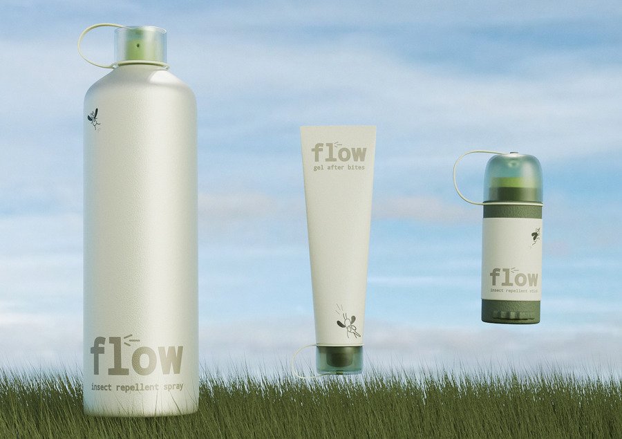
The flow insect protection brand project serves as an example of applying communication theory to packaging design. Instead of emphasizing insect bites, danger, and the need for protection, the brand offers a more positive interpretation of the product category. The product is presented as a part of a comfortable summer experience, associated with travel, outdoor activities, and leisure.
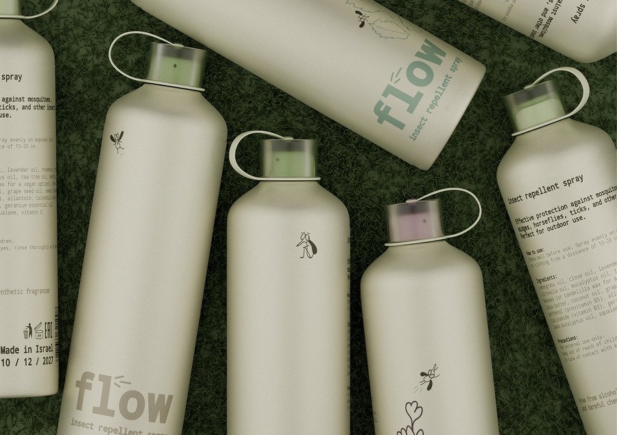
Through its visual language, packaging system, and additional brand touchpoints, flow communicates the idea of protection as a natural and unobtrusive element of everyday life. In this way, design functions not only as a means of product presentation but also as a tool for communicating the brand’s values and worldview.
Brand presentation for a wide audience
Restrained natural shades and funny illustrations of mosquitoes make the packaging visually friendly, while maintaining a sense of cleanliness, functionality and modern design.
Flow is a brand of insect repellents that is always with you due to its compact appearance.
For whom
The main audience of the brand is young adults aged 18-35 who appreciate the convenience, mobility and aesthetics of surrounding objects. Unlike traditional repellents associated with medical supplies or emergency protection, flow integrates into the user’s habitual lifestyle.
«flow — всегда с собой»
The main message of the brand
The slogan emphasizes the idea of constant user support and perceives the product not as a forced purchase, but as a natural accessory for a comfortable stay.
Communication tasks
Positive perception of the category
The design helps to rethink repellents not as an alarming or purely utilitarian product, but as a lightweight, modern and visually pleasing accessory for everyday use.
Reducing anxiety
Ironic mosquito characters soften negative associations with insects. Instead of feeling dangerous, the packaging conveys play, humor, and control over the situation.
Emotional connection with the user
Funny illustrations and friendly visual presentation make the product closer to the user. The brand is perceived not as a strict protective tool, but as an understandable and sympathetic companion in the warm season.
Packaging as a communication medium
The product surface works not only as a shell, but also as an independent visual language of the brand. Illustrations, color, and shape convey the character of the product without the need for additional explanations.
Stimulating user-generated content
The attractive appearance of the packaging makes the product photogenic and visible in the daily environment. This makes it more likely that users will share it on social media.
Recognition among the young audience
The modern palette, minimalistic shape and ironic graphics help the brand stand out on the shelf and become more memorable for a young audience accustomed to visually expressive products.
Brand values
The brand’s communication strategy is built around several key values.
Comfort
The brand strives to make insect protection a simple and natural part of everyday life. This idea is supported by compact packaging formats and the convenience of using products.
Lightness
Instead of visual images of danger and struggle, the brand uses a calm natural aesthetic associated with relaxation, travel and summer experiences.
Freedom of movement
The name flow refers to the state of flow and continuity. The user can freely do their favorite things without being distracted by the discomfort of insects.
Proximity to nature
The color palette is based on natural shades of green, blue and beige. It forms associations with the natural environment and supports the eco-friendly image of the brand.
Aesthetics of everyday things
Packaging is designed as an object that you don’t want to hide. Due to this, the product becomes part of the user’s visual culture and receives additional communication potential.
Presentation for a professional audience in the field of design
The flow brand’s communication strategy has been developed as a comprehensive visual system aimed not only at the end user, but also at the professional community of designers, marketers, and branding specialists.
The main objective of the project was to rethink the visual code of the category of repellents. Traditionally, such products use communication through fear, warning, or threat demonstration. In the flow project, this approach is replaced by communication through comfort and positive experiences.
Visual rhetoric
The brand name refers to the concept of «flow state», creating associations with ease, continuity and freedom of movement. This idea is supported by the entire visual system of the brand.
The color palette includes muted natural shades of green. This decision creates associations with nature, recreation and the summer season.
The typography is based on the use of modern grotesque, providing good readability and visual neutrality.
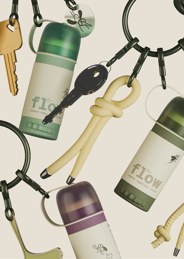
Branded key rings are an additional communication tool. They perform not only a decorative function, but also become an element of brand expansion beyond packaging. The user receives a physical object that continues to remind them of the brand even outside of the purchase and use of the product.
The semiotic system
Mosquitoes as symbols of a threat turned into a game
The visual image of mosquitoes is used not only as a direct indication of the purpose of the product, but also as a symbol of the problem with which the repellent interacts. At the same time, the insects are not depicted realistically and frighteningly, but as funny graphic characters. Due to this, the threat sign is reinterpreted: the mosquito ceases to cause alarm and becomes part of the brand’s playful, ironic communication.
Natural shades as a code of safety and naturalness
Beige, olive, green and muted shades form a visual connection with nature, air, vegetation and open space. This palette reduces the chemical feel of the product and encodes it as softer, safer, and more casual. Color works as a sign of trust, that is, the product is perceived not as an aggressive means of protection, but as a careful object of care.
Compact shape as a sign of mobility
The small packaging format informs the user that the product is easy to take with you (in a bag, backpack, for a walk, on a trip or on vacation). Compactness becomes a visual code for convenience and freedom of movement. The shape of the product conveys the idea that insect protection can always be at hand and does not require a complex use case.
Illustrations as an emotional brand code
Graphic characters on the packaging surface add personality to the product and make it more memorable. They work as emotional markers and create a light mood, evoke a smile and form a friendly tone of communication. Due to this, packaging is perceived not only as a functional object, but also as a carrier of the brand’s character. In general, each element of packaging — color, shape, illustration, and material — does not work separately, but within a single semiotic system. Mosquitoes represent a problem, a natural palette translates safety, a compact shape communicates mobility, and graphics create emotional engagement. Together, these signs form the image of a modern, friendly and visually expressive product.



