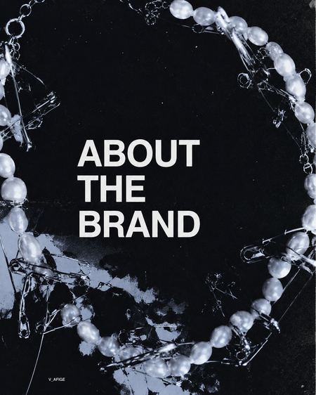
INTRODUCTION
V_AFIGE is a contemporary handmade jewellery brand founded by designer Petr Zaitsev. The brand creates jewellery from pearls, mother-of-pearl and natural stones, combining artistic experimentation with wearable design. Unlike traditional jewellery brands that focus on luxury and status, V_AFIGE positions jewellery as a tool for self-expression and identity construction. The brand develops two product lines: PROSTOE and SLOJNOE. PROSTOE includes more minimal and everyday pieces, while SLOJNOE consists of experimental designs that function as artistic statements. Through this dual structure, the brand allows consumers to choose different modes of self-presentation, ranging from subtle personal expression to bold visual communication

V_AFIGE operates within the niche of independent designer jewellery and targets consumers who value individuality, creativity and authenticity. The brand’s core idea is helping people express different sides of their personality through the aesthetics of «simple» and «complex». Unlike mass-market accessories, V_AFIGE emphasises handcrafted production, limited quantities and unique designs. Many pieces exist as single editions or are produced in very small numbers. As a result, the brand communicates exclusivity not through luxury pricing but through originality, artistic value and personal meaning. The visual identity of the brand is strongly connected to contemporary art, alternative fashion and creative culture. In its communication, jewellery is presented not as a decorative object but as a symbolic extension of the wearer’s personality

The target audience of V_AFIGE consists primarily of people aged 18–35 living in large Russian cities and actively participating in creative and cultural environments. The audience includes students and professionals working in design, fashion, photography, contemporary art, music and other creative industries. Research conducted by the brand identifies several audience segments. The first group, «Self-Explorers», uses fashion and accessories to experiment with identity and personal style. The second group, «Aesthetic Observers», is highly sensitive to visual culture and values beauty, symbolism and artistic expression. The third group, «Conscious Creators», seeks meaningful and authentic products that reflect personal values and reject mass-market consumption. Finally, the «Provocateurs» segment uses appearance as a form of self-expression and social statement. Despite their differences, all audience groups share an interest in individuality, visual culture, creative communities and alternative forms of self-expression. For them, jewellery functions not only as an accessory but also as a medium of communication and identity construction
COMMUNICATION CHANNELS
(Communication Ecosystem)
V_AFIGE uses a multi-channel communication system that combines social media, digital platforms and offline presence. The brand’s communication ecosystem consists of Instagram, Telegram, a dedicated website and physical points of sale
(Instagram as the Main Communication Channel)
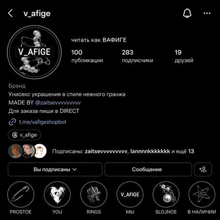
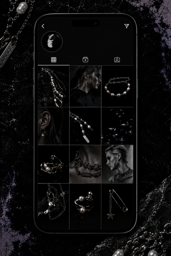
Instagram is the central communication platform of V_AFIGE. The account functions simultaneously as a portfolio, catalogue and visual storytelling platform
Examples of Instagram post layouts
The visual identity of the profile is highly consistent and recognisable. The feed uses experimental compositions, dramatic lighting, artistic photography and contemporary fashion aesthetics. Jewellery is rarely presented as a standalone product. Instead, it becomes part of a larger visual narrative that communicates identity, emotion and creative expression.
Through Instagram, the brand constructs a distinctive visual world that reflects its values and positioning
Examples of Stories that show the brand’s visual communication style and interaction with the audience
(Website)
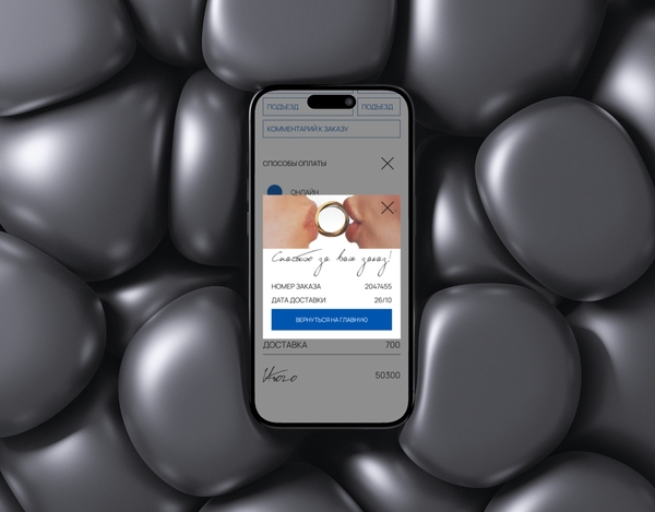
As part of the brand development process, a dedicated website was designed for V_AFIGE. The website extends the brand’s communication beyond social media and provides a structured digital environment for presenting collections, brand values and visual identity
The website translates the aesthetic language of V_AFIGE into an interactive digital format and supports a consistent brand experience across different communication channels

(Telegram Channel)
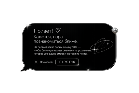
The Telegram channel serves as a more intimate and informal communication space. While Instagram focuses on curated visual content, Telegram allows the brand to establish closer relationships with its audience
By opening access to internal creative processes, the brand increases transparency and creates a stronger emotional connection with its audience. Followers are able to observe not only the final product but also the stages of its creation, which reinforces the perception of V_AFIGE as an independent handmade jewellery brand
(Brand Tone of Voice)
The communication style of V_AFIGE can be described as semi-casual, emotionally expressive and slightly provocative
According to the brand platform, the tone of voice is positioned between serious and playful, respectful and bold, as well as between enthusiastic and restrained. This combination reflects the values of the brand and resonates with its creative audience

(PR Strategy)
V_AFIGE employs a positioning-driven PR strategy focused on cultural value rather than direct commercial promotion. Brand visibility is achieved through participation in design-oriented platforms, collaborations with cultural institutions and representation within contemporary creative discourse
V_AFIGE uses a positioning-based PR strategy focused on cultural relevance rather than traditional advertising. Brand awareness is achieved not only through publications in design and cultural media, such as «Создатель» and «Город Прима», but also through participation in local design markets and exhibitions, as well as presence in carefully curated multi-brand spaces such as HSE Art and Design Store and Golden Caravan. These activities strengthen the brand’s connection with independent design, contemporary visual culture and creative communities
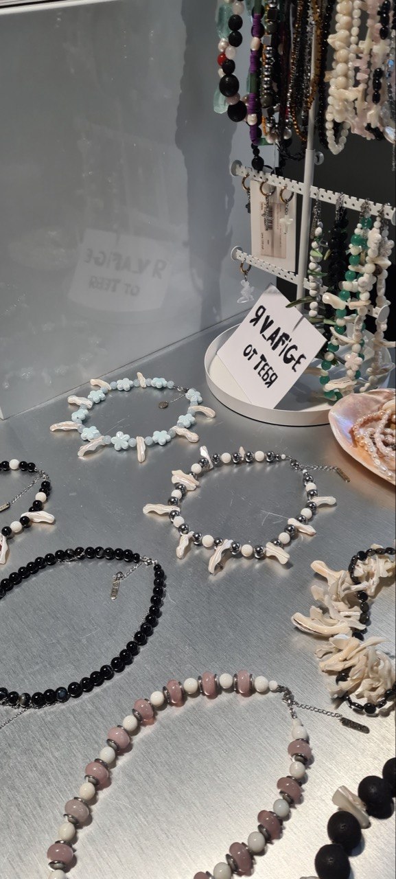
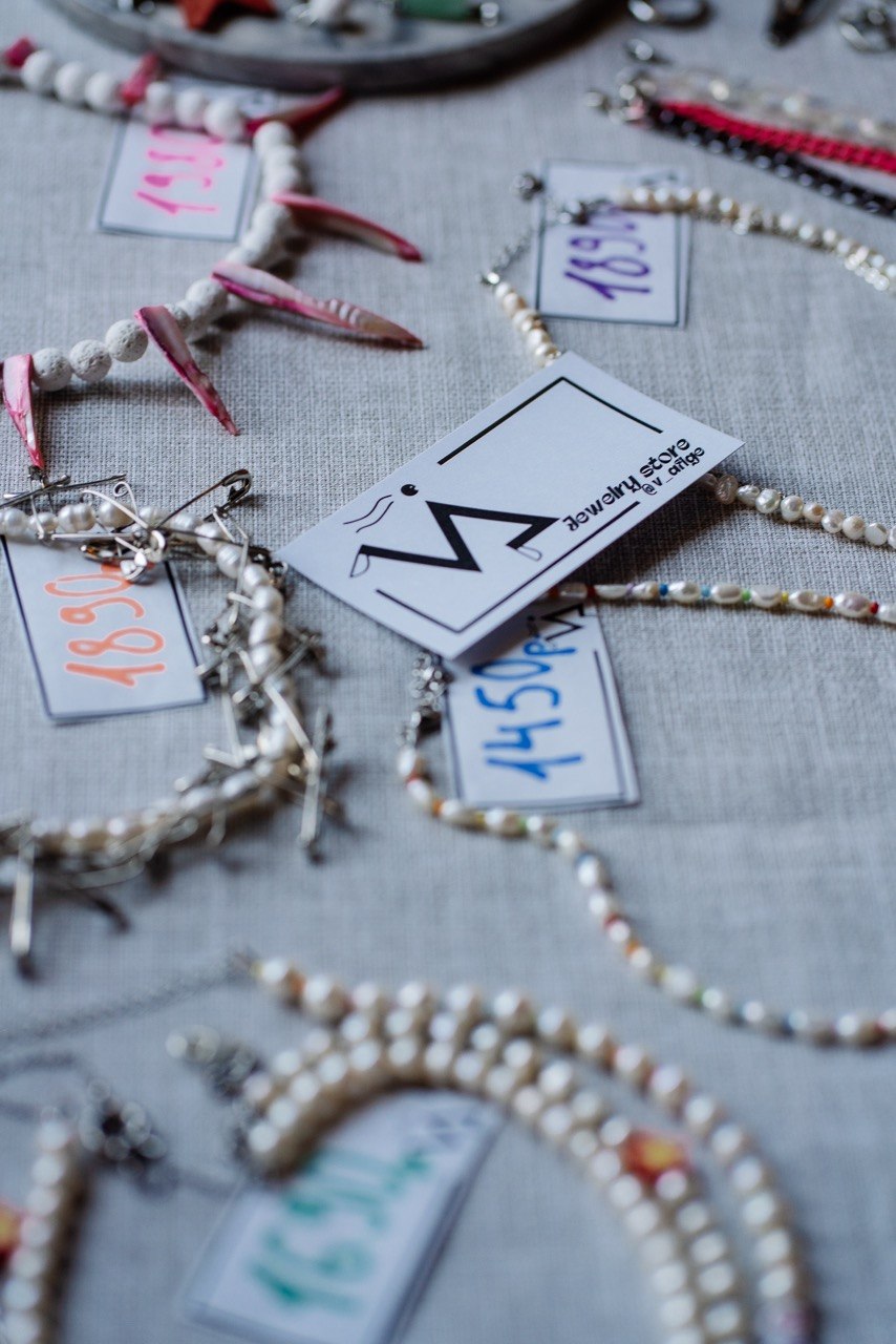
Example of how the brand is presented in the market
A key component of the PR strategy is the consistent construction of a distinctive brand identity across all communication channels. Through editorial photography, artistic direction and a coherent visual language, V_AFIGE develops a recognisable aesthetic code that differentiates the brand from both mass-market accessories and traditional jewellery brands
THEORETICAL FRAMEWORK
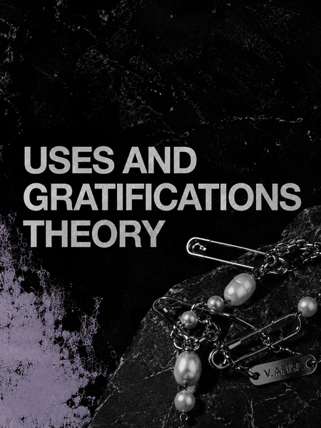
(Uses and Gratifications Theory)
Uses and Gratifications Theory emerged as a response to traditional media effects research and shifts the focus from what media does to people to what people do with media. The theory views audiences as active participants who consciously choose media and communication channels according to their goals and needs. It assumes that people select content that helps them satisfy specific motivations and forms of gratification.
According to the theory, audience choices are driven by individual needs rather than passive exposure to communication. Media and communication channels therefore compete for users’ attention by offering different forms of value and satisfaction
This theory is relevant to V_AFIGE because consumers choose the brand not only for the functional qualities of its products, but also for the values it provides, including self-expression, individuality and aesthetic appreciation. Within the brand’s communication, jewellery is presented as a tool for constructing and expressing personal identity, which closely aligns with the core principles of Uses and Gratifications Theory
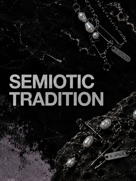
(Semiotic Theory)
According to the Semiotic Tradition, communication is understood as the creation and sharing of meaning through systems of signs and symbols. Rather than focusing only on words, semiotic analysis examines how meaning is communicated through visual elements, cultural codes and symbolic representations
The course emphasizes that signs and symbols are central to communication because meanings are often transmitted indirectly. In advertising and branding, visual elements communicate ideas and values without explicitly stating them. The key task of semiotic analysis is therefore to decode the meanings embedded within images, symbols and visual forms.
This theory is particularly relevant to V_AFIGE, as the brand relies heavily on visual communication. For example:
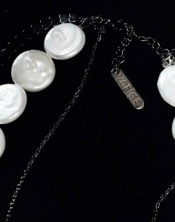
(1) Playfulness and edginess expressed through jewelry design and materials — combining metal spikes with delicate mother-of-pearl and pearls. (2) Unisex approach (in the brand’s campaigns, the same pieces of jewelry are seen on both female and male models)
The brand constructs meanings associated with individuality, experimentation, creative freedom, and self-expression. Semiotic theory provides the tools to analyze how exactly these meanings are conveyed through the brand’s visual identity
ANALYSIS: SEMIOTIC THEORY


(1) Jewellery as a Sign System
According to Semiotic Theory, objects can function as signs that communicate meaning. In V_AFIGE, jewellery is presented not only as a product but also as a medium of communication. The pieces convey ideas of individuality, creativity and self-expression, allowing consumers to communicate aspects of their identity through appearance

(Jewellery as a Sign System)
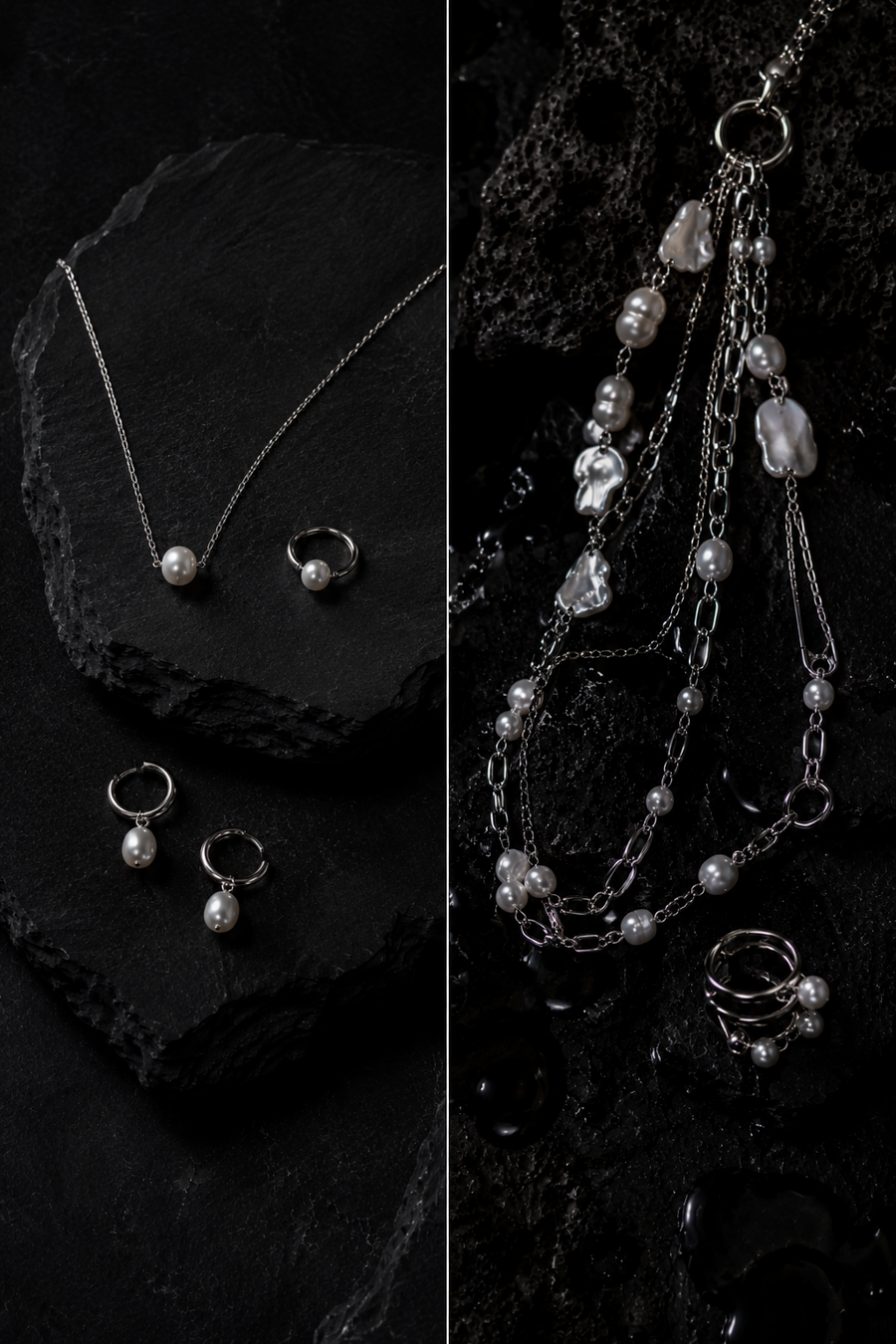
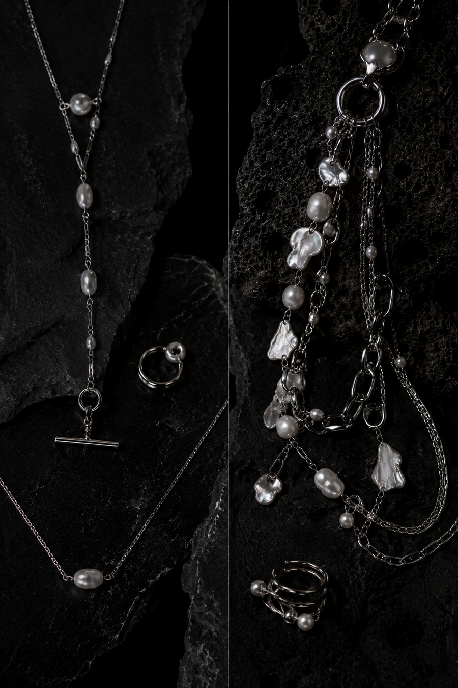
(2) Symbolism of Materials
Materials play an important role in the brand’s visual language. Pearls and mother-of-pearl traditionally symbolize elegance, beauty and natural uniqueness. V_AFIGE reinterprets these materials through contemporary design, connecting them with creativity, experimentation and artistic expression.
(Symbolism of Materials)
(3) PROSTOE and SLOJNOE as Symbolic Opposition
The division between PROSTOE and SLOJNOE creates a symbolic contrast. PROSTOE represents simplicity, restraint and everyday self-expression, while SLOJNOE communicates boldness, experimentation and visual impact. Together, these collections reflect the idea that identity is multidimensional and constantly changing.
(PROSTOE and SLOJNOE as Symbolic Opposition)
(4) Photography as a Meaning-Making Tool
The brand’s photography extends meaning beyond product presentation. Elements such as water, movement and unconventional composition create associations with transformation, freedom and self-discovery. The jewellery becomes part of a broader visual narrative rather than a standalone commercial object
(Photography as a Meaning-Making Tool)
(5) Tone of Voice as a Sign
Semiotic analysis can also be applied to language. V_AFIGE uses a communication style that balances seriousness and experimentation. This tone reinforces the brand’s positioning as an independent creative project and supports its values of individuality and self-expression.
(Tone of Voice as a Sign)
(6) Visual Identity Summary and Key Findings
The semiotic analysis reveals that V_AFIGE constructs its communication through a carefully developed system of visual and symbolic codes. Across its jewellery design, photography, styling, tone of voice and digital platforms, the brand consistently communicates meanings related to individuality, creative freedom and self-expression. Rather than positioning jewellery as a functional product or a marker of status, V_AFIGE frames it as a symbolic medium through which consumers can articulate identity, values and belonging. The brand’s communication therefore operates on a cultural level, creating meanings that extend beyond the physical object itself. As a result, the value of V_AFIGE lies not only in the products it offers, but also in its ability to provide consumers with a visual language for expressing and negotiating their sense of self within contemporary creative culture
Communication Theory: Bridging Academia and Practice // edu.hse.ru URL: https://edu.hse.ru/course/view.php?id=133853 (accessed: 20.05.2026).
Personal archive of V_AFIGE
Chat GPT generations [Electronic resource]. URL: https://chatgpt.com (accessed 29.05.2026)


