About Me
I’m a graphic designer exploring visual communication through branding, visual identity, exhibition design, poster design, and merchandise. I enjoy experimenting with visual concepts, exploring different approaches, and turning ideas into meaningful visual experiences.
CASE STUDY 01 // EXHIBITION IDENTITY & MERCHANDISE SYSTEM
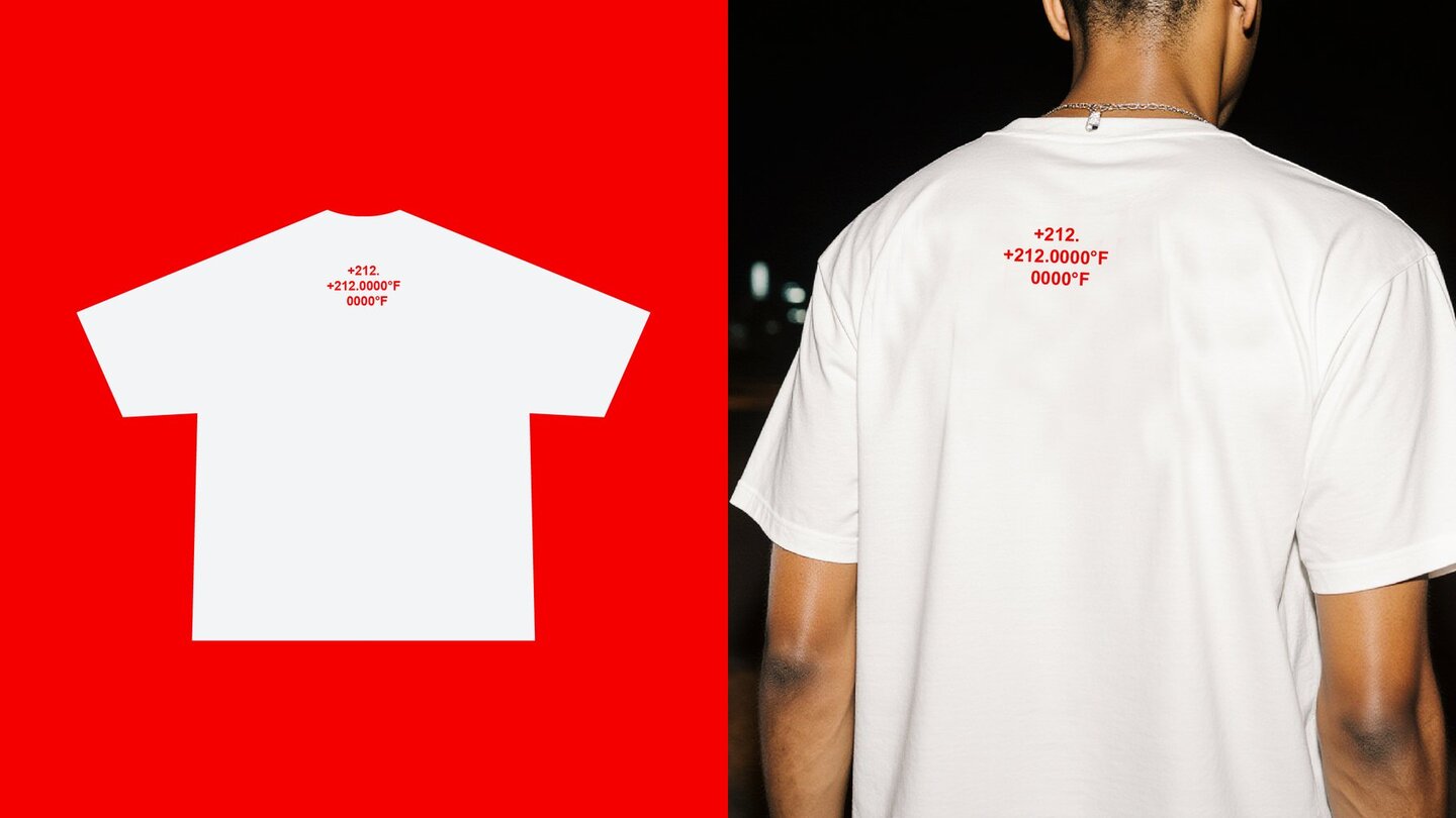
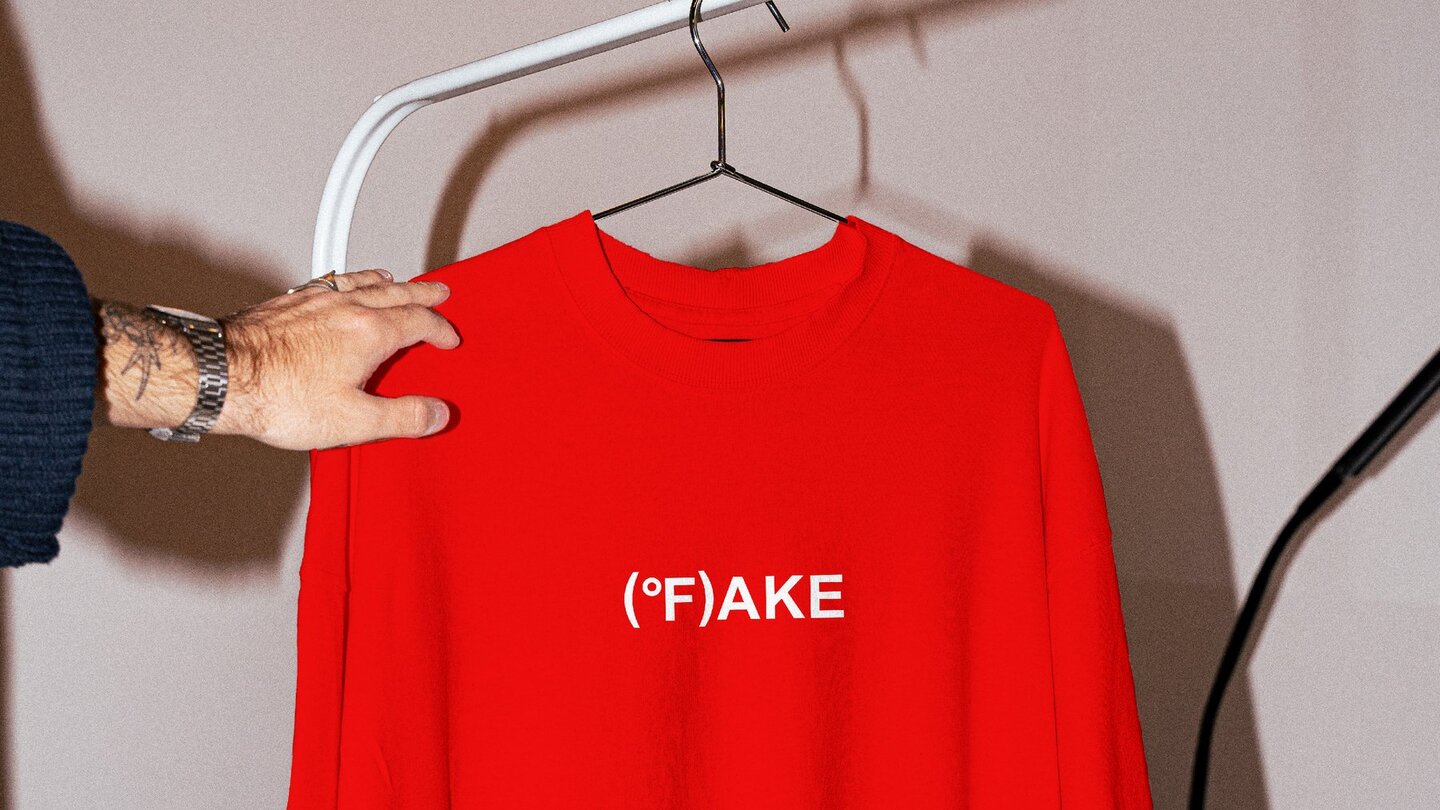
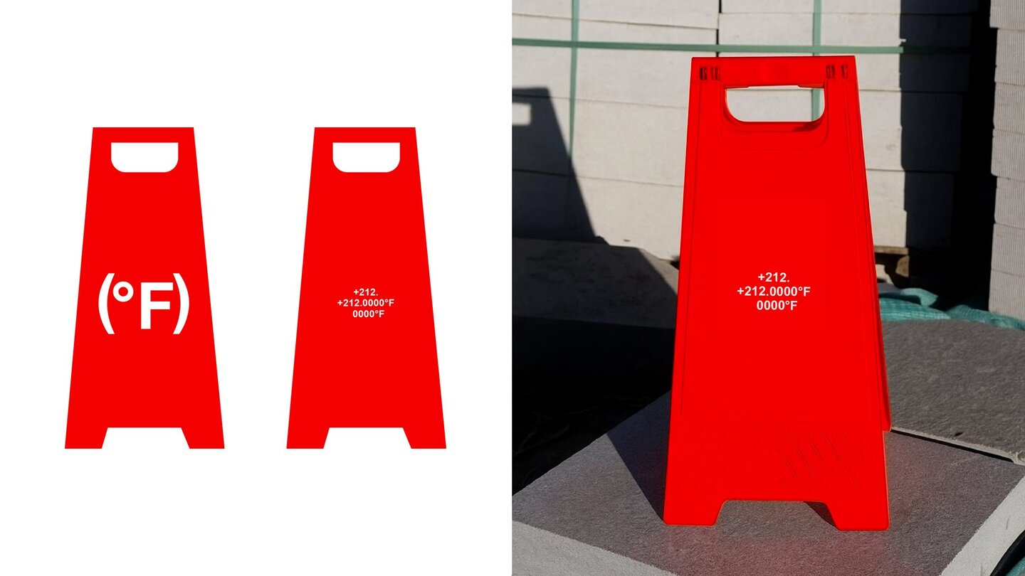
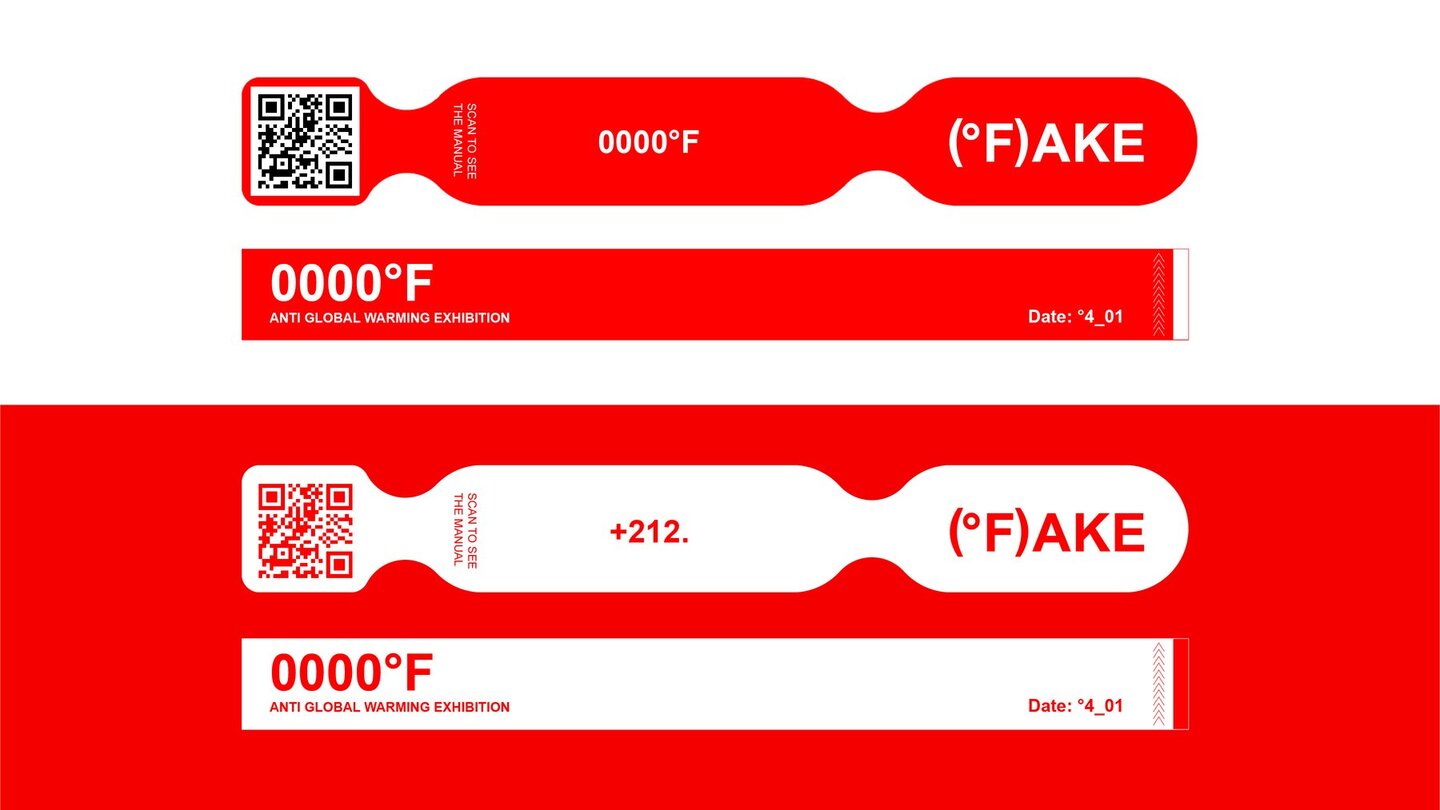
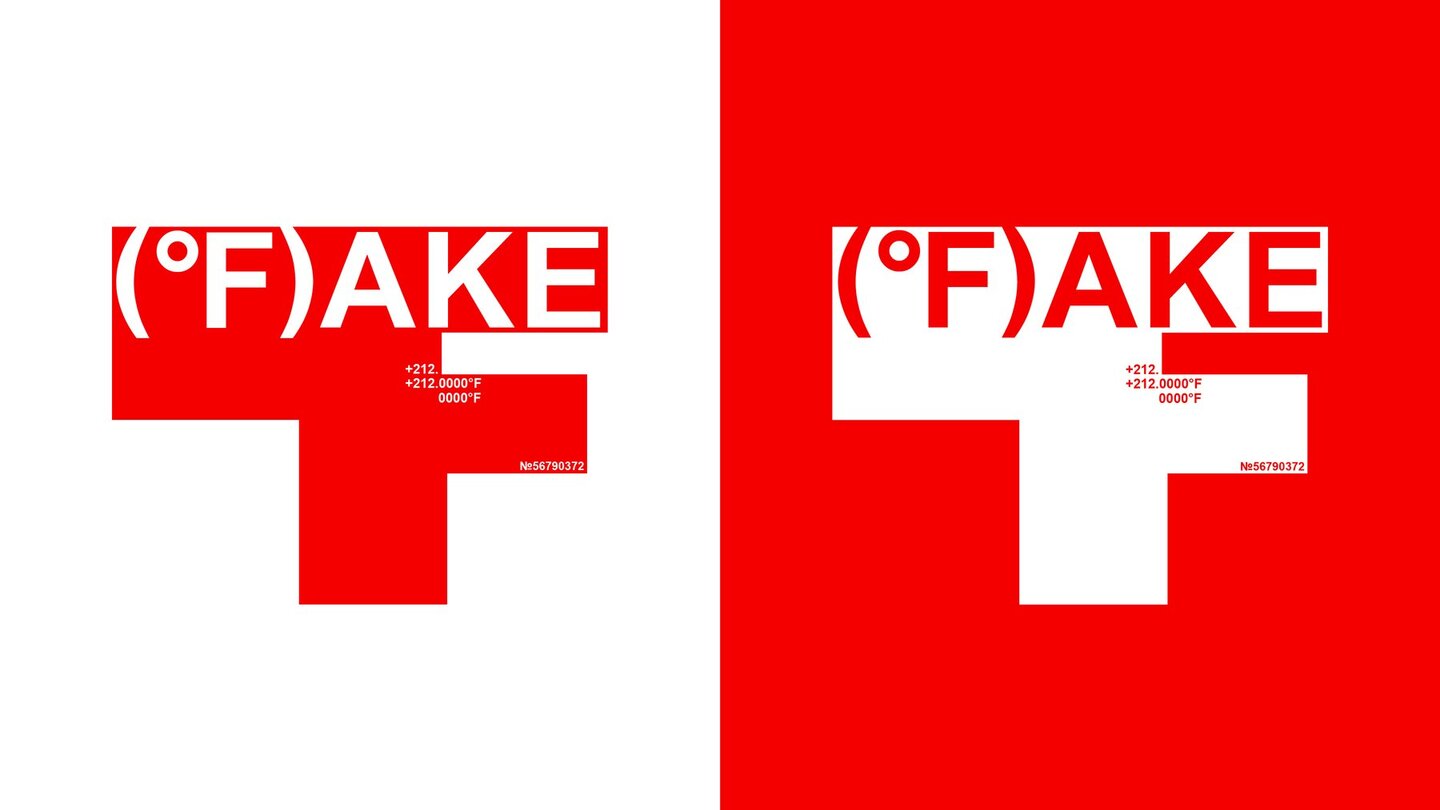
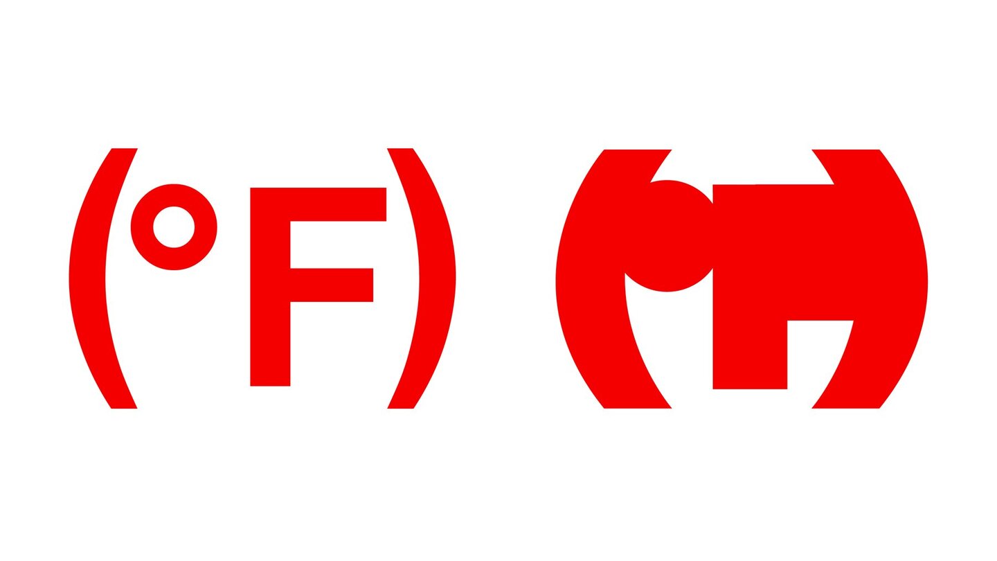
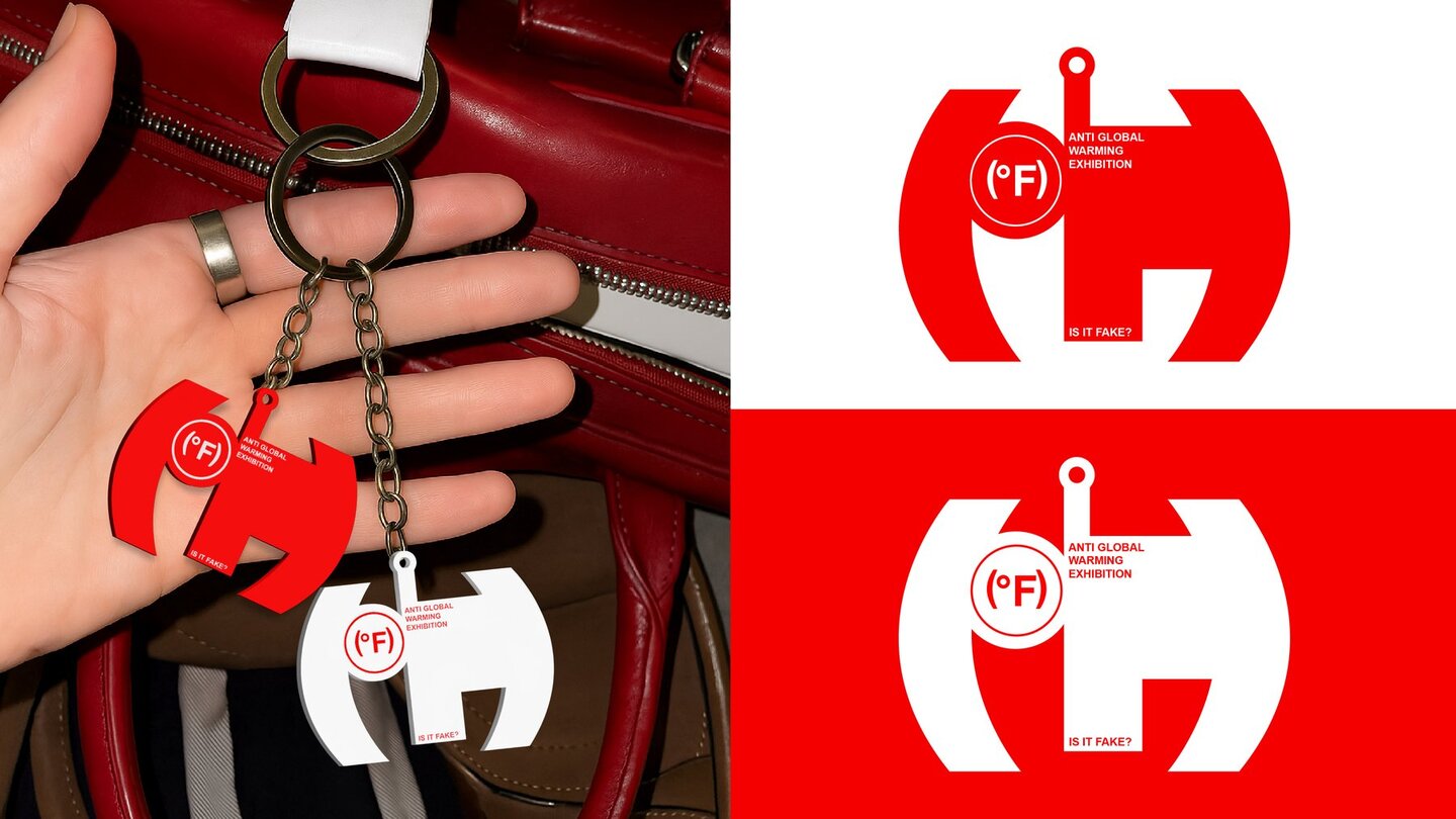
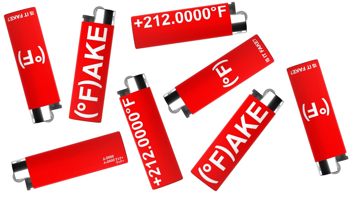
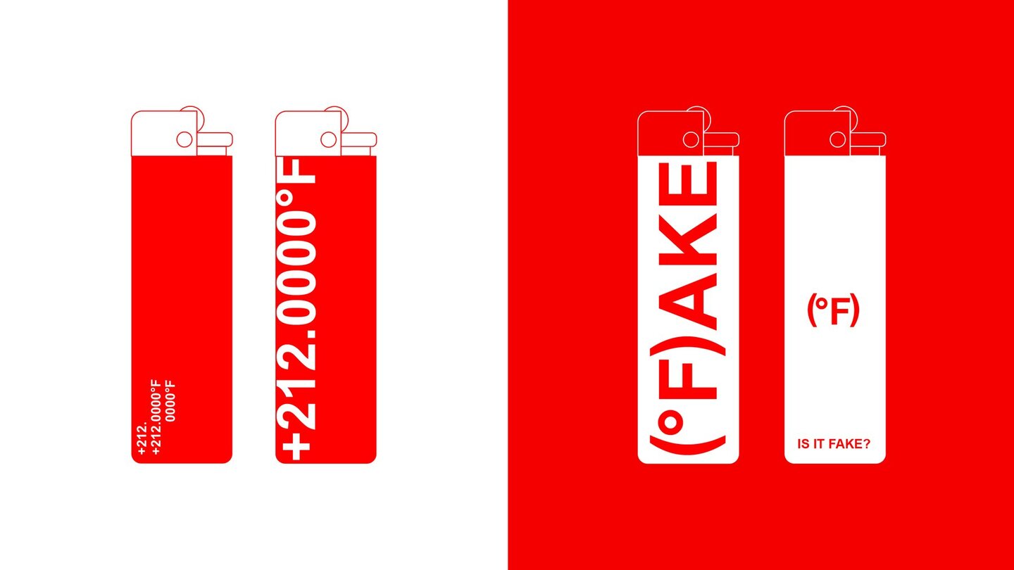
The exhibition challenges the official narrative on global warming, exposes contradictions in the data, and highlights the political and economic interests driving the climate hysteria.
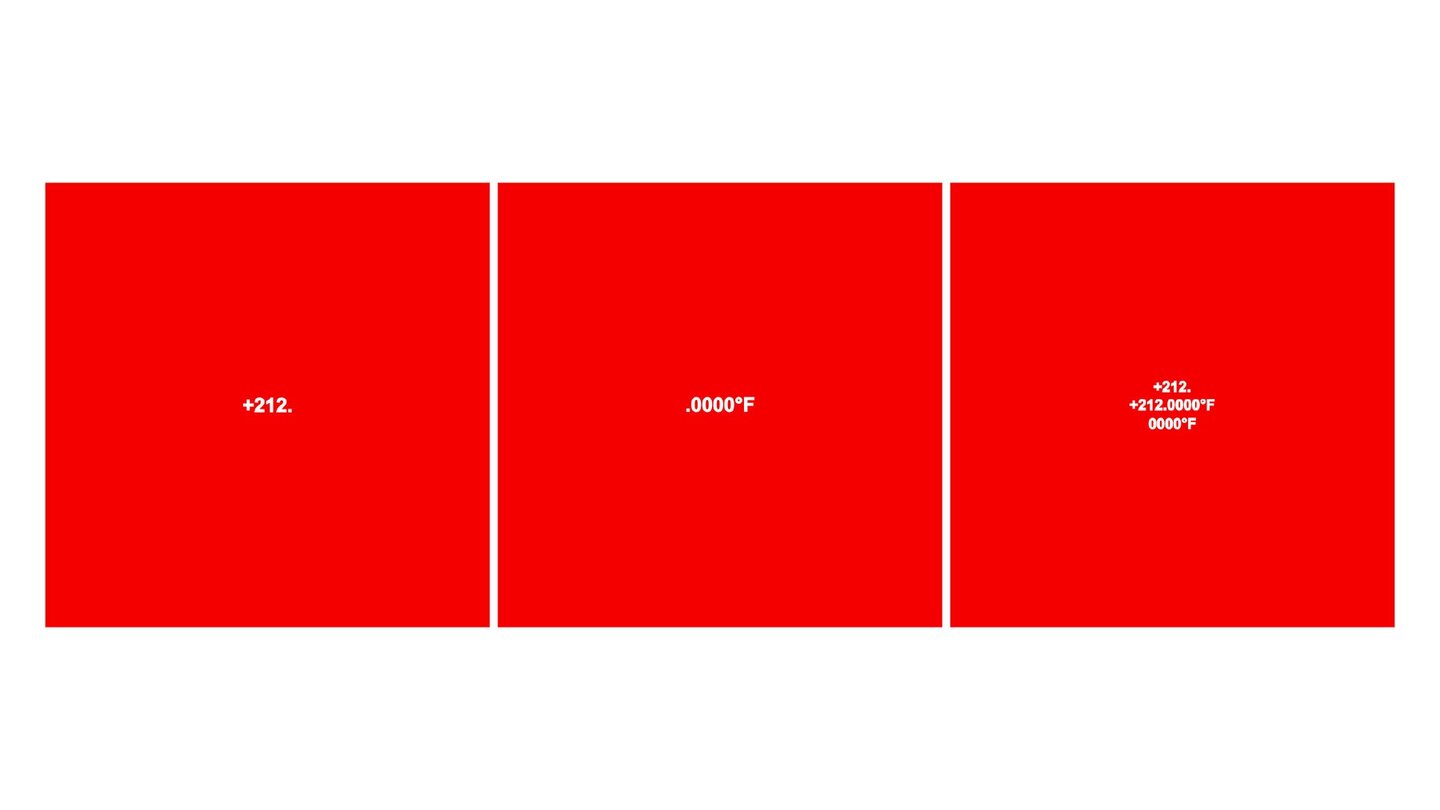
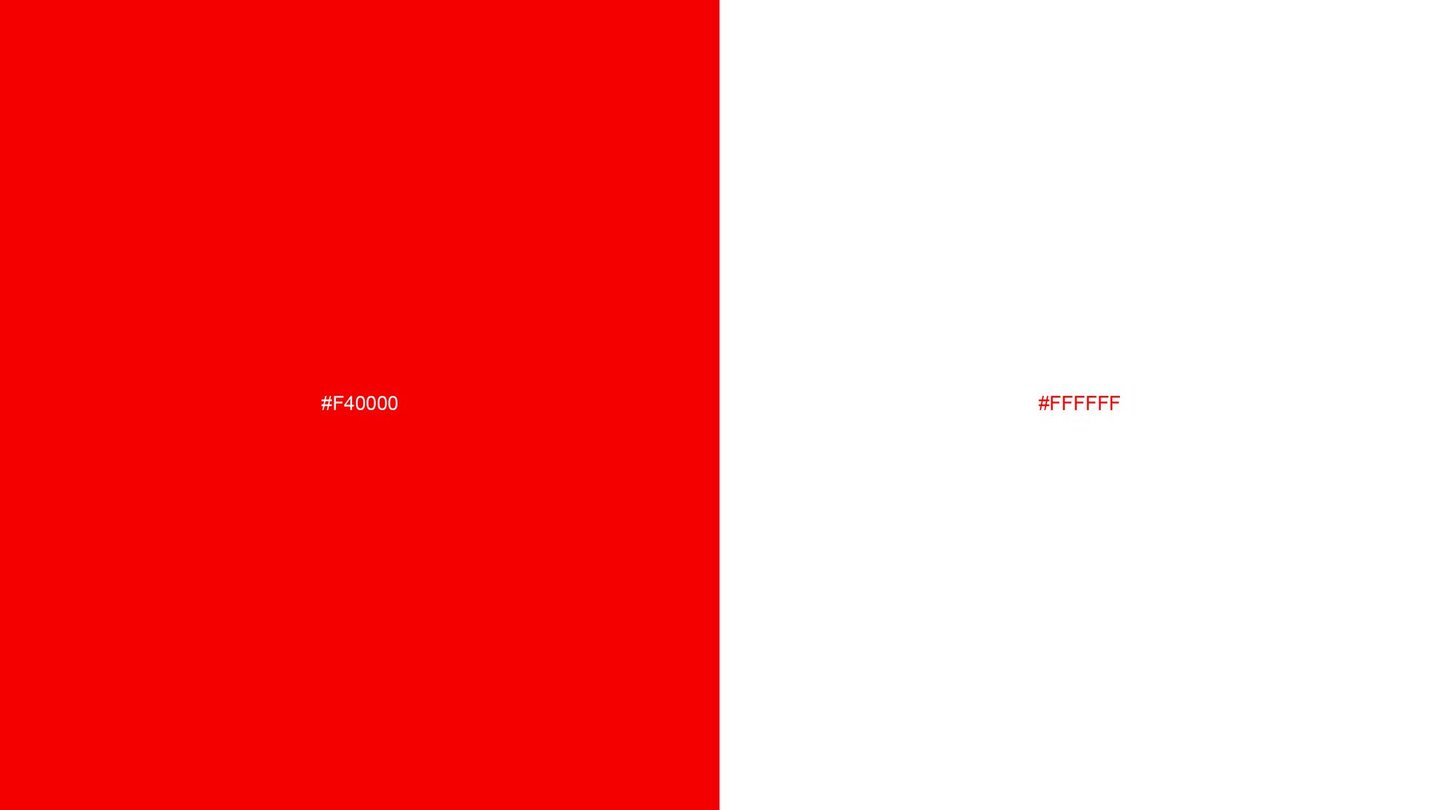
212°F = 100°C (the boiling point of water) — an allusion to data that has been artificially «heated up.» Four zeros serve as a symbol of pseudo-science; while genuine science allows for margins of error, this presentation creates the illusion of absolute truth. °F stands for degrees Fahrenheit. The color red signifies danger and the urgency of the issue.

CASE STUDY 02 // BRAND MERCHANDISE & PACKAGING
The brand makes jewelry from recycled plastic collected from the ocean. The entire visual identity and logo are based on marine coordinates—the exact spots where the plastic was found. Below, I am showing the merch and packaging I designed for this project.
CASE STUDY 03 // POSTERS
A series of exhibition posters created for a jewelry brand specializing in 3D-printed designs. The visual concept explores the intersection of technology, art, and contemporary jewelry, translating the brand’s identity into a distinctive exhibition experience.