Hello, I’m Sasha!
and I am a Media Designer
In my work I use familiar and traditional visual imagery, reinterpreting it through new perspectives and meanings while preserving the form of the original
I work with graphic design, typography, photography, alternative printing techniques, unconventional print formats, and optical illusions
let me show you some of my projects >
1. zine ''пайрем-влак''
For this zine, I explored the idea of a «cultural code» through the lens of traditional Mari celebrations
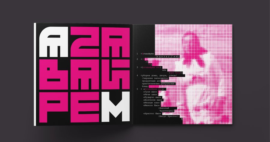
I developed a visual language that combines traditional embroidery patterns with the techno-aesthetic of monospaced typography, commonly associated with programming
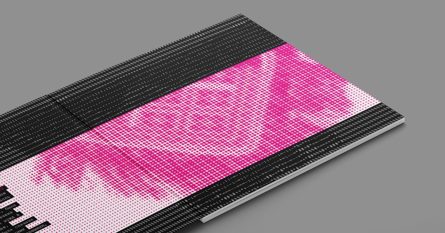
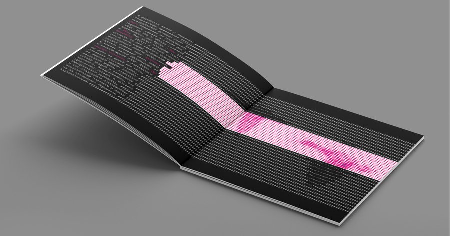
The colour palette reinterprets traditional Mari embroidery: black and white remain unchanged, while red is replaced with magenta — a colour associated with mass production.
This contrast connects traditional handcraft with contemporary visual culture.
2. calendar of Yoshkar-Ola
This calendar explores the complex history of Yoshkar-Ola and the intertwined relationship between Russian and Mari cultures, marked by the suppression of the latter and the lasting influence of the past
To reflect this tension, texts in both languages overlap, distinguished by different typefaces and colours. The Soviet legacy is echoed in the brutalist typography and grid system, referencing the city’s panel-block architecture
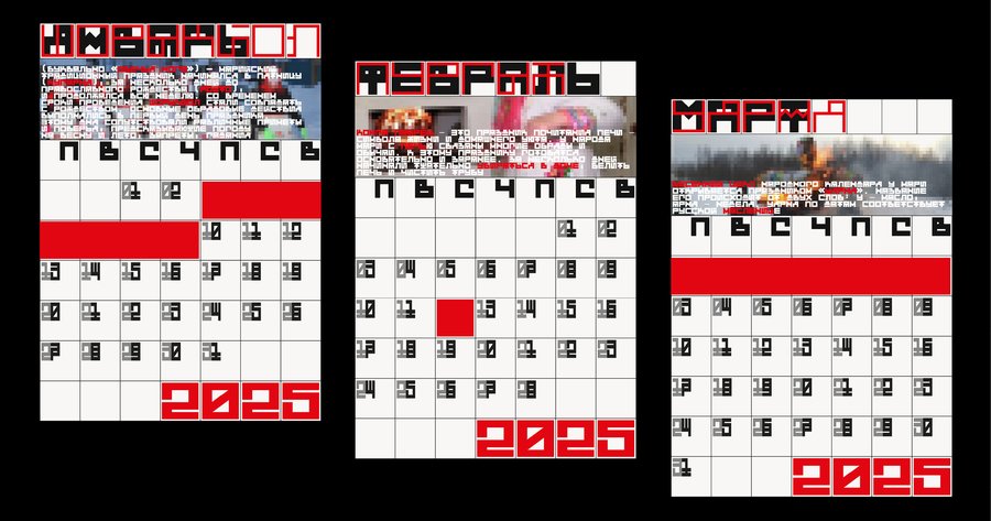
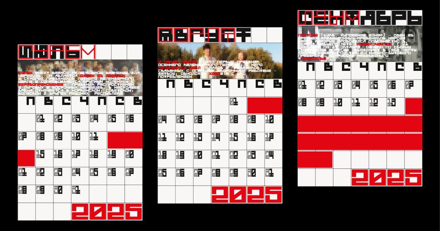
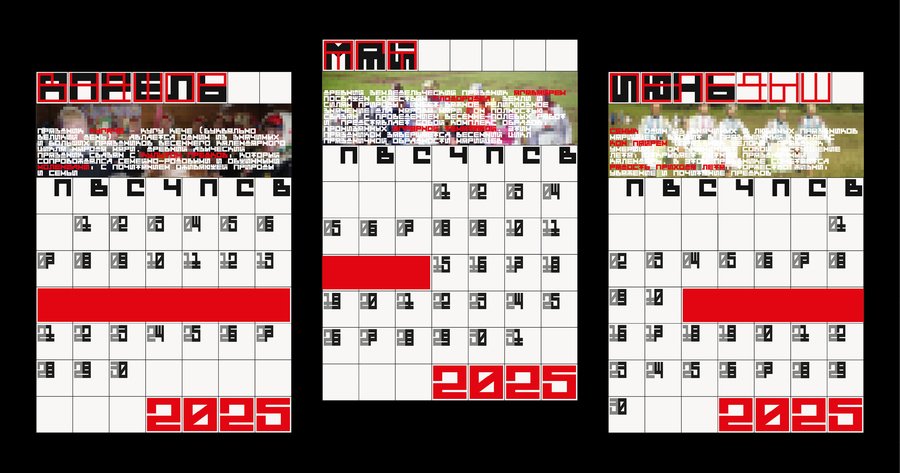
Holidays are marked with red ribbons — a reference to traditional Mari costume and, at the same time, a visual metaphor for censorship
This dual meaning reflects the troubled history of the Mari language
3. go-themed posters for media dedicated to abstract games
The concept behind these posters is to combine two visual references to the Go board: the Hermann grid illusion and the bars of a cage
The aim of Go is to surround your opponent’s stones while protecting your own territory. The flickering spots of the Hermann grid illusion echo the pattern of the goban, while urban metal fences translate the game’s central principle into a physical form: claiming territory and restricting movement. The irregular holes in the fences suggest attempts to break through, escape, and win
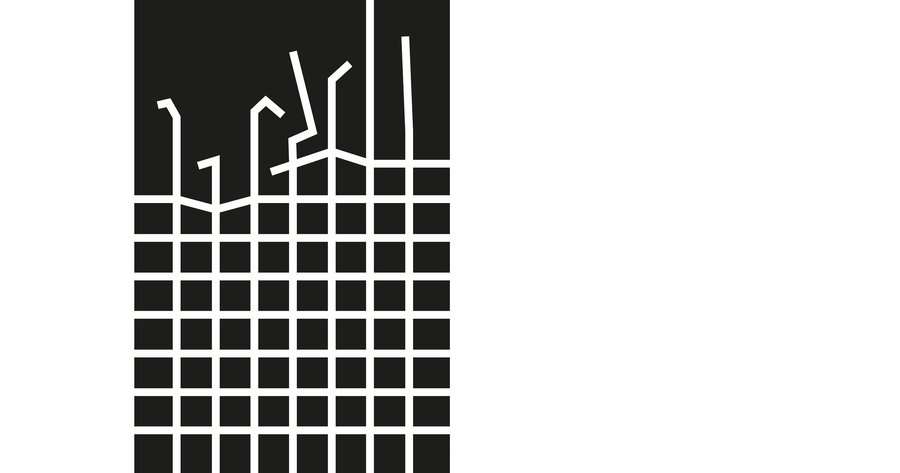
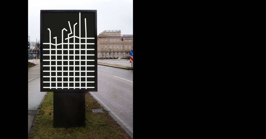
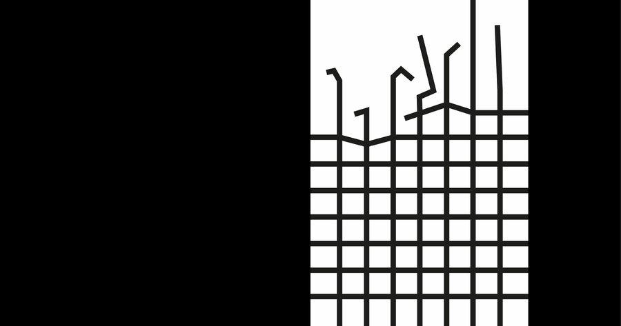
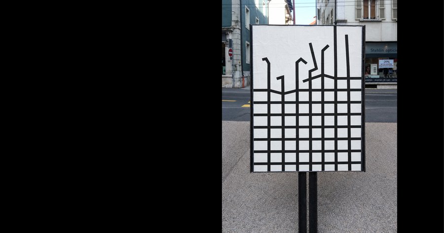
The posters were designed for large-format printing (100 × 150 cm), allowing them to become part of the urban landscape and blend into the scale of city blocks
If you like what you see, let’s work together
Feel free to get in touch via e-mail:
aikleptsov@edu.hse.ru