Navigator
- Brand History — Date of Creation — Why the Crocodile
- Corporate Visual Language — Brand Style — Logo — Color — Simplicity — Slogan — Typography
- Commercial Video Analysis — Timeline — Instincts — Archetypes — Visual Design — Color — Image Perception — Composition — Attention Grabbing — Perception Scenarios — Sexuality in Advertising
- Conclusion

Lacoste — a French company that produces clothing, footwear, perfumes, eyewear, watches, and various leather goods. Founded in 1933, its symbol and logo is an image of a green crocodile [1]. The brand was established by the French tennis player Jean René Lacoste, who was a player himself.
Why the Crocodile? 1926 — US Open Tennis Championship. On that day, Jean René first wore a white polo shirt that he made himself, which differed from the traditional «city» long-sleeved shirts of the time. The short-sleeved polo was made from a light knit fabric, which is comfortable for playing in the heat.
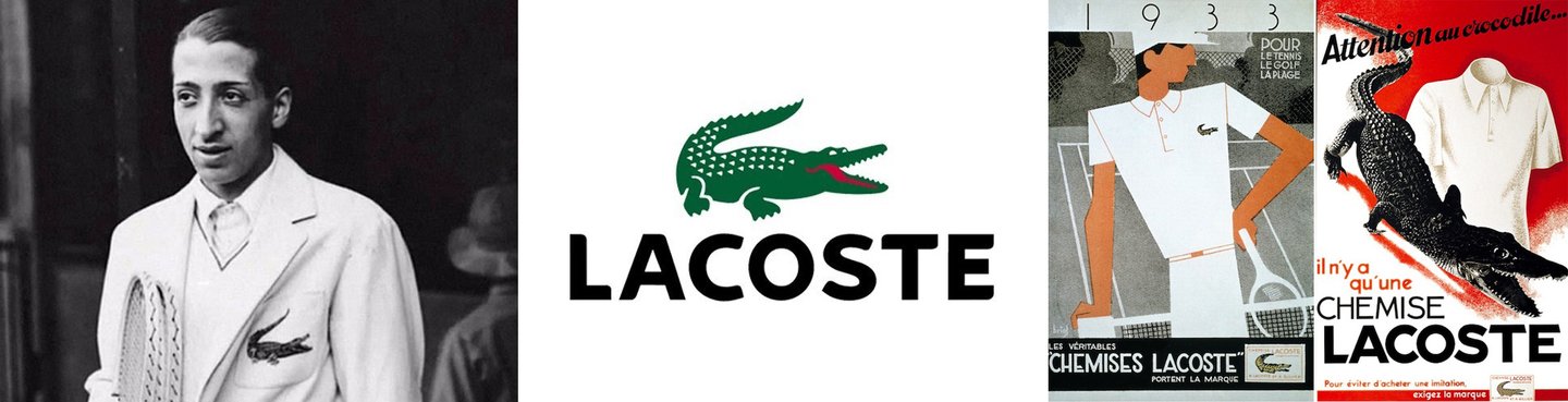
Fig. 1. Jean René Lacoste; the brand’s outdated logo / Fig. 2. The first advertising campaign, 1933.
1927 — Davis Cup. The American press nicknamed Lacoste the «alligator» due to a dispute: in 1923, the captain of the French tennis team promised René a crocodile suitcase if he won the tournament.
The nickname — «alligator”—eventually stuck because of his demeanor on the court; he allowed no mistakes from his opponents.
After launching his clothing line, many tennis players wore and continue to wear Lacoste polo shirts and dresses.
Brand Identity. Lacoste’s visual perception of the brand is tied to its vibrant color palette, original logo, and clean design lines.
Logomark The foundational principle of Lacoste’s visual identity is the use of the crocodile’s image and symbolism. The crocodile serves as the company’s signature symbol and logomark. This easily recognizable symbol allows the brand to be instantly identifiable.
The crocodile is associated with a strong, fast, and efficient creature. This imagery speaks to athleticism, dynamism, and a high-energy lifestyle, which aligns with the brand’s ideology.
Colors The brand primarily uses three core colors: — Black — for typography; — White — for the background (referencing the iconic polo stripes); — Green — for the logo. Green is the primary color, directly associated with the brand. It draws a parallel to nature and freshness, which helps merchandise capture attention on store shelves. Green also aids in creating an emotional connection with the brand by balancing specific personality traits.
Fig. 3. Lacoste Logo
Simplicity Simplicity is another principle in perceiving the Lacoste brand. Simple shapes and clean lines allow the brand to be recognized quickly and easily in any situation. This design attracts new customers to the brand and maintains the interest of existing ones. The company has adhered to a minimalist presentation for quite some time, which remains timely to this day, focusing the potential buyer on what matters most.
Slogan Lacoste’s slogan reads: «Life is a beautiful sport.» This phrase conveys the core values of the French brand—confidence, perseverance, freedom, and mindfulness.
Figure 4. Brand Slogan
Typography The brand utilizes a typeface with clear letterforms that avoids readability challenges, aids memorability, and creates complete brand association. All of this, as a whole, makes the font simple yet highly effective.
For the analysis, the commercial «Timeless,» released in 2017 by the French brand Lacoste, was selected. The director’s cut, which is 1:30 in length, was used as the basis because it gained more popularity than the 46-second advertising version.
Timeline The commercial can be divided into several segments, each demarcated by a specific time period: from the 1940s to the present day—the period of the brand’s active existence.
The specific era a viewer associated with was conveyed through the clothing of the main characters, which shifted in the frames depending on the time period the principal actors inhabited. Additionally, the white polo shirt—the founding element of the brand—evolved slightly but always maintained a recognizable silhouette.
Fig. 5. Timeline — 1940s–1960s
Figure 6. Timeline — 1970s to Present
The video tells the story of two people who meet by chance at a train station and chase each other through different eras across centuries in the hope of meeting again.
The main character is a man who, upon their encounter, initially pays no mind to the unexpected meeting, but after thinking for a while, realizes he could lose what might be the great love of his life. The situation can be explained by the vital instinct for self-preservation.
Visual content in the advertisement, featuring shots of a woman and a man running after each other across the ages, evokes feelings of romance, adventure, risk, passion, perseverance, and wild love in the viewers. In memetics, this can be categorized under the Opportunity Window: «Seize the moment, or they’ll run away!»
The Sexual Instinct is also emphasized—it has modules for quantity, preference for healthy genes, and sexual curiosity. The sexual curiosity module favors novel and unusual partners, promoting genetic diversity and preventing inbreeding. The preference for healthy genes module assesses beauty, markers of health, and fertility.[3]
Fig. 7. Main Character
We would like to highlight the Archetype of the main character. It combines two types positioned at opposite ends of the continuum: «society (belonging) — development (change, risk).»
The «hero» archetype is presented in a somewhat altered form. Noteworthy are its energy, strong will, decisiveness, and courage. He overcomes difficulties, running toward his destiny despite all the challenges and trials in his path—like time itself (several centuries).
Rich. 8. The Space of Archetypes
The «Lover» Archetype manifests in perfect correspondence. The main character strives to stand out. Through his appearance and behavior, he proves that he is the only one she needs. He strives to be the best, the most desired, the most important. He appears as a confident individual who commands admiration from others through his looks, manners, and actions.[3]
Visual Design The video’s visual aesthetic is rendered in the style of high cinema, utilizing soft tonalities and constantly emphasizing the pursuit. The footage is enchanting and mesmerizes the viewer, drawing them in—all of this is achieved through: — Fascination via the Audio Channel. The musical score incorporates symphonic melancholy and emotion; the viewer perceives that the main characters suffered separation and desperately desired reunion, all of which is clearly underscored by the music. The advertisement is memorable because it evokes emotion. — Color Perception On a subconscious level, color triggers physiological changes in the body. The video imagery is executed in warm tones, which contributes to raising body temperature, pressure, and accelerating the pulse.
Color The creators subtly deviated from the main green palette, opting instead for colors that could psychologically influence the potential buyer.
Throughout the video series—including the background, environment, decor, and the characters' clothing—four colors predominate. These colors are justified based on the color emotion characteristics chart and the selection summary: — Brown — reliability, stability; — Red — passion, love; — White — purity, sincerity; — Blue — interest, trustworthiness. It is unsurprising that the latter two colors were prominent specifically in the characters' attire. In this way, the creators position the qualities of their product that the brand upholds overall.
A subtle hint of brand affiliation was provided by a small logo on the main character’s white t-shirt, which accompanied us throughout the plot.
Fig. 9. Logo on the banner
Visual Perception Although the entire video sequence is fast-paced and dynamic, there are several scenes that stand out due to their slower pacing. For instance, the collision of the main characters occurs right at the beginning of the video. At this stage, the viewer is introduced to the «story’s» characters, who are highlighted against a plain white background. The creators achieved this by manipulating visual perception, as humans tend to notice figures that stand out against a lighter background.
Fig. 10. Moment of collision/meeting the characters
Composition Particular attention should be drawn to the techniques used in the promotional video, specifically the arrangement of elements and the zonal structure of the images. The first thing that catches the eye is the framing and camera movement.
The prevailing composition of the scenes is mainly structured according to the principle of a vertically symmetrical composition: the main action takes place in the center. A vertically symmetrical composition is perceived more easily and gives the impression of order.