About me:

Hi, I’m Svyatoslav.I’m a communication designer specializing in brand identities rooted in local culture and place.I work with tourism destinations, hospitality businesses, and independent brands whose identities are closely connected to specific places, their culture, and history.My goal is to discover what makes each brand unique and translate these qualities into contemporary visual identities. By combining local heritage with modern design, I help brands develop a distinctive character, connect with their audiences, and communicate their value.
My approach — Finding identity in place
What makes a brand unique?I believe that a brand’s connection to a place can become one of its greatest strengths.My approach begins with an in-depth exploration of the local context — its culture, history, people and everyday life. Through field research, observations and conversations with local communities, I look beyond familiar symbols to discover unique details and stories that shape the brand’s character.I transform these discoveries into contemporary visual identities that reflect the character of each place. By connecting research with design, I create visual systems that express a brand’s individuality, communicate its values and build meaningful connections with its audience.
Selected works:
Three Brands. One Approach.
Each place has its own character, and every brand has an opportunity to express it.
These three projects show my approach to building visual identities through research and interpretation. Each case focuses on a different source of identity: place, nature, and heritage. Together, they demonstrate how local context can become the foundation of a distinctive and contemporary brand system.
First — Place

Kemskaya VolostContext:Kemskaya Volost is a historic region on Karelia’s White Sea coast, often overlooked as a transit point to the Solovetsky Islands. The goal was to reveal its unique character and create a tourism brand that positions the region as a destination in its own right.Concept:The identity is based on the metaphor «A Stop on the Way Back to Yourself.» Through field research, local history and conversations with residents, I developed a visual identity that invites travellers to slow down, reconnect with nature and discover the unique atmosphere of the North.Year: 2025 Tools: Adobe Photoshop, Adobe Illustrator, Figma, Midjourney, Runway
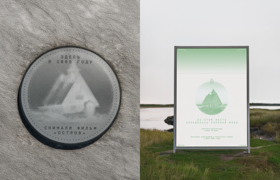
An example of how the region’s historical visual elements are transformed into a metaphor and incorporated into the brand identity.
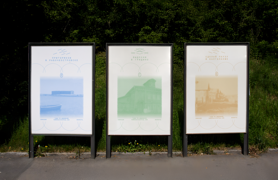
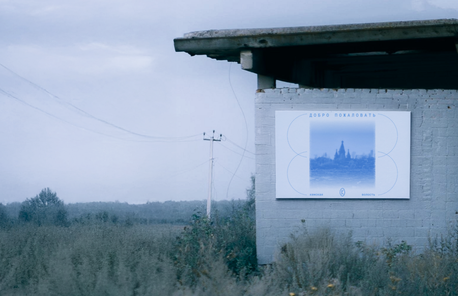
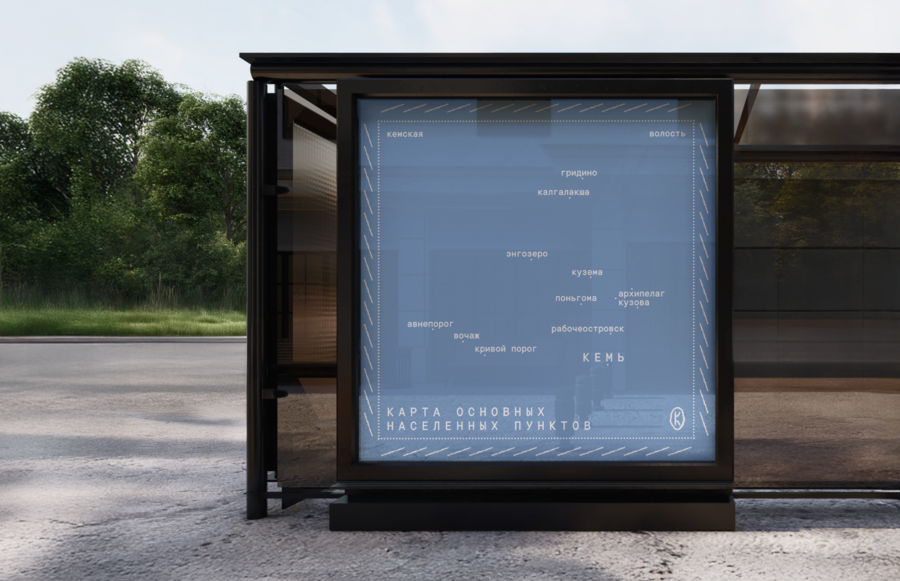
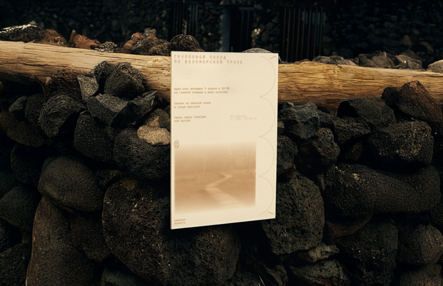
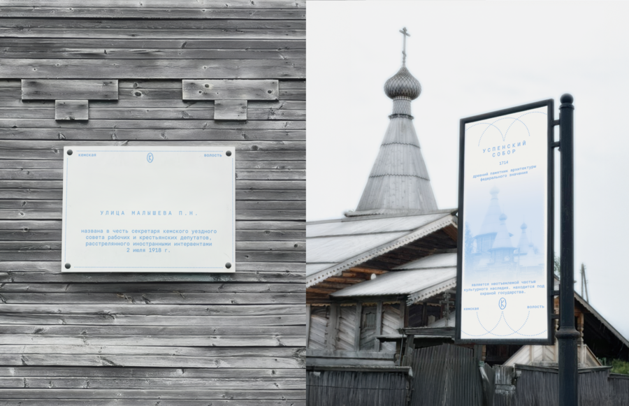
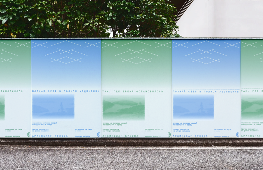
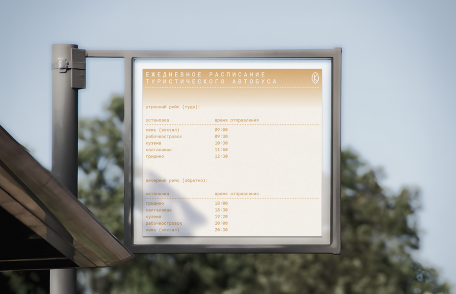
The visual identity extends across various applications, including wayfinding systems, tour and hiking operators, public transport, and signage at local attractions.
During the project, I spent several weeks living in Kem to explore the region firsthand. I conducted field research, spoke with local residents and representatives of the local administration, and analyzed my observations. The key insights from this research formed the foundation of the brand platform.

Result:
I developed a complete tourism brand with a clear brand platform, distinctive positioning and a cohesive visual identity. The resulting system presents Kemskaya Volost as a destination in its own right and provides a foundation for promoting the region, attracting visitors and communicating its unique character.
Second — Nature
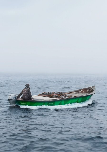
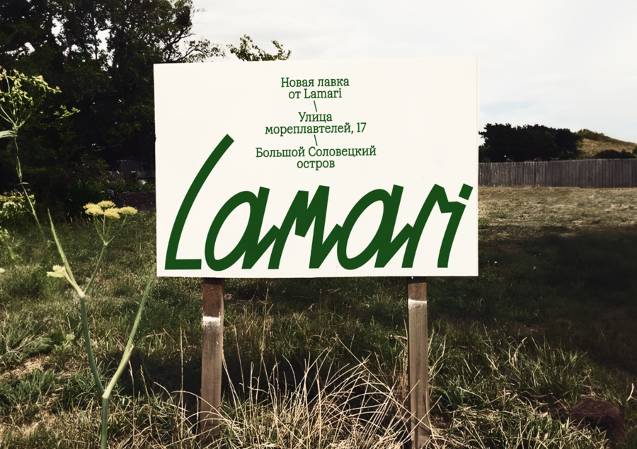
LamariContext:Lamari is a brand of natural products made from White Sea seaweed. Kelp and bladderwrack are harvested by hand to protect the marine ecosystem. The goal was to create a distinctive identity that highlights the brand’s northern origins, respect for nature and commitment to healthy living.Concept:The identity draws inspiration from the White Sea and the organic character of seaweed. I translated these natural qualities into expressive typography, shades of green and a flexible graphic system. The concept connects the brand’s local origins with a contemporary visual language.Year: 2024 Tools: Figma, Adobe Illustrator, Adobe Photoshop, Adobe InDesign, Midjourney, Runway
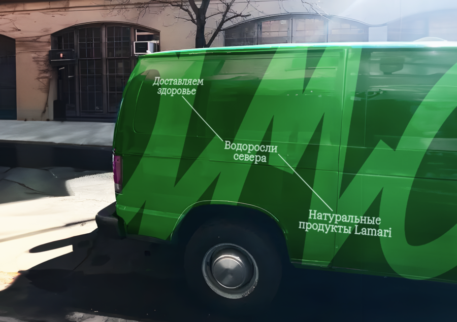
The visual identity reinterprets the shape of seaweed through typography. Lettering and patterns represent seaweed on the seabed, while a vertical line becomes a stem, with text blocks branching out like leaves.
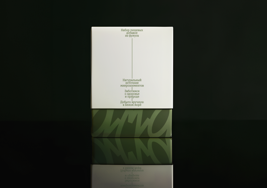
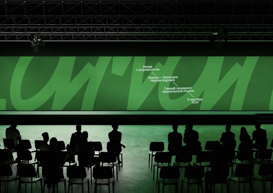
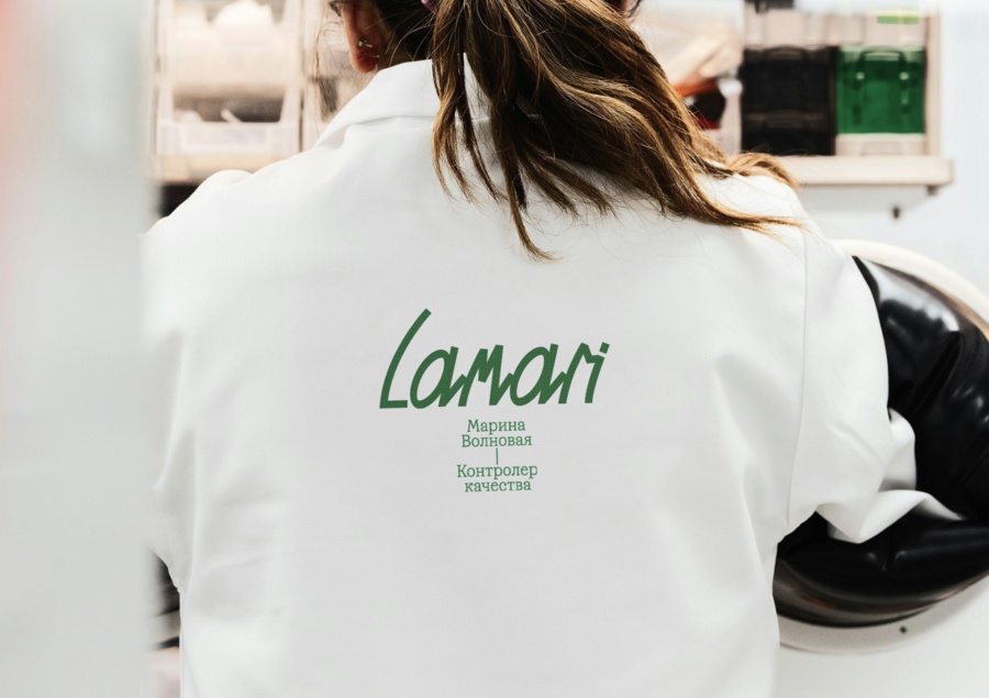
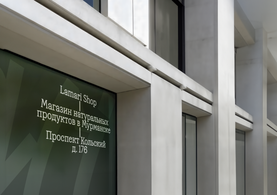
I designed a range of branded materials, including product packaging, staff uniforms, banners for expert presentations, and in-store wayfinding.
I explored the history of seaweed harvesting around the Solovetsky Islands, traditional processing methods and the production of natural wellness products. My research helped me identify the region’s unique qualities and transform them into a meaningful foundation for the brand identity.
Result:
The brand’s connection to the White Sea is reflected in a cohesive visual system — from product packaging and staff uniforms to in-store navigation and promotional materials. Together, these elements create a recognizable brand identity that highlights its natural origins, unique character and values.