Navigation Menu
Concept
Chapter 1. Creating the Image of a Closed Community
1.1. Quasi-institutional identity
1.2. Aesthetics of secret documents and hierarchies
Chapter 2. Constructing the Image of Esoteric Knowledge
2.1. The image of a branched system of knowledge
2.2. Fragmentation
2.3. Obfuscated readability
Chapter 3. Transitional Interface Barriers
3.1. Entry interface
3.2. Concealed navigation
Conclusion
References
Concept
How does a web interface create the impression that behind a public page lies knowledge accessible only to a select group?How a user perceives information online largely depends on how it is presented.
The web interface plays a crucial role in this, as it defines the conditions under which a visitor encounters the site’s content—through the organization of access to materials, the establishment of navigational paths between pages, and the linking of individual elements.
The degree to which these relationships are obvious to the user can vary. In some cases, the logic behind the site’s structure is revealed gradually as the visitor explores it, or it may remain ambiguous. Hidden links, fragmented text, and images presented without familiar context compel the viewer to independently explore the site and interpret what they see.
The ambiguity of connections leaves room for various interpretations and assumptions about what lies behind the visible elements.
In this context, a single page can be perceived as a fragment of a much larger space whose content cannot be grasped entirely. The assumption that this space exists, along with the desire to discover its boundaries, creates a sense of mystery.
In a digital environment, a feeling of enclosure can arise even when pages are freely accessible. The site’s entry conditions, navigation, and presentation of materials influence how a visitor perceives its content.
Combined, these features can create the impression that the site is intended for a specific circle of people familiar with its internal structure.
This research explores the visual and interface strategies through which images of secret knowledge and closed communities are formed in cyberspace.
The website is examined as an environment where the combination of graphics, text, and user interaction allows for the construction of a sense of one’s own history, structure, and intended participants.
The key research question is how visual and interface conventions create a sense of hidden knowledge and the existence of a closed community within online space. The hypothesis is that the images of enclosure and inaccessibility emerge from a combination of techniques related to the community’s identity, the presentation of knowledge, and the organization of access to the website’s content. Interacting with one another, these conventions prompt the visitor to independently build connections between the materials and assume the existence of a hidden system.
The goal of this research is to identify and analyze these techniques, and to trace how they interact with one another within the structure of the website.
The research is structured based on a typological principle: visual and interface techniques are grouped according to the principles of creating an image of a closed space. Each chapter is dedicated to one of these aspects: community delineation, the presentation of knowledge, or the organization of access to the site’s content.This approach allows us to trace how the structure of the website influences the perception of its content and shapes the understanding of what remains hidden from the visitor.
Selection of Visual Material for Analysis focuses on projects that use graphics, text, and interface design to construct images of secret knowledge and a closed community. When examining these, both individual elements and the sequence of interaction with the website are taken into account.When studying this topic, special attention was paid to theoretical works concerning net art and the specificities of the digital environment, as well as to project descriptions and interviews with their creators. Textual sources are compared with visual materials, enabling an examination of the artistic intent and the historical context of their creation.Chapter 1. Creating the Image of a Closed Community
In networked projects, information can be presented as part of a vast system whose structure is not entirely clear to the visitor. Catalogs and indexes create an impression of order, whereas fragmented pieces and difficult-to-read texts leave the meaning of that system ambiguous.
This chapter examines how the organization and presentation of materials shape the perception of knowledge—its meaning and interconnections—which the visitor is invited to uncover independently.
1.1. Quasi-Institutional Identity
One way to establish the identity of a community in web projects is by employing the visual markers of organizations and institutions. Names, abbreviations, emblems, and logos help form the perception of a specific structure, unifying the site’s materials under that entity’s banner.However, a recognizable institutional form does not always come with clear information regarding the organization’s activities or structure. This mismatch creates room for interpretation, fostering a sense that there is a more complex system hidden behind the site’s visible elements.The first elements of project self-presentation are their titles, which refer to various types of organizations.
Bureau of Inverse Technology uses the word bureau («bureau»), which denotes an institution, and technology («technology»), which points to the technical field of the institution’s activity.The full name and its abbreviation, BIT give the impression of an established organization with its own official designation.The abbreviation is also used in the project’s graphic materials, serving as an independent designation for the bureau.
A similar reference to institutional lexicon can be seen in the title of another project: Laughing Horse’s Orifice Headquarters.The word headquarters («headquarters») suggests the presence of an organizational center. Yet, it is paired with an absurd phrase that fails to reveal the nature of the organization’s activities.
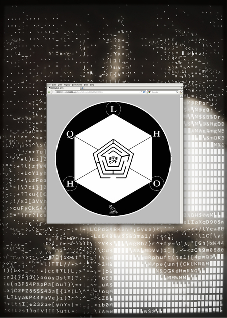
Similar to the BIT (Bureau of Inverse Technology), the abbreviation LHOHQ evokes associations with acronyms from government agencies, scientific institutions, or large organizations.
Such designations imply a lengthy, official name and project an image of a complex organizational structure within the institution.
At the same time, the abbreviation conceals the absurdity of the full title behind an externally neutral combination of letters.In the web project title, Neurocam International, the organization’s image is shaped by the indication of the scale of its intended activities.The word international, similar to the designation global common in the names of large corporations, evokes associations with an extensive structure whose operations extend beyond the borders of a single country.
The combination of Neurocam references neuro- and video technologies, but it does not reveal the specific function of the organization. This ambiguity sustains an atmosphere of mystery, leaving the visitor room to speculate about its activities.
Beyond names and abbreviations, the organization’s image is solidified through its unique emblems and logos, which serve as visual signifiers of its identity.
The design for the Bureau of Inverse Technology utilizes various logo variations that combine the abbreviation BIT, the bureau’s full name, and elements in the form of a matrix grid and a schematic representation of a globe, which is often associated with international technology organizations.
At LHOHQ (Laughing Horse’s Orifice Headquarters), the institutional symbolism takes on a different character.The Laughing Kookaburra Gazette features a round, black-and-white emblem with the letters LHOHQ, geometric elements, and the ancient Egyptian Eye of Horus symbol inside a central hexagon.