About me
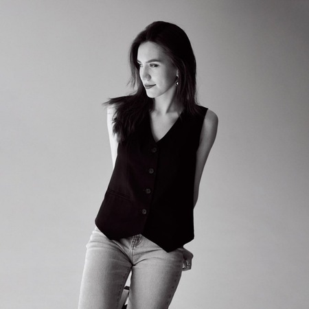
I’m a brand and communication designer completing my degree in Communication Design at HSE Art and Design School.Alongside my studies, I’ve gained professional experience working directly with clients on branding projects and as part of an in-house team. This has taught me to respond to real briefs, collaborate with others and develop ideas within practical constraints.I’m interested in working with founders of independent brands and teams behind cultural projects to create visual identities that express what makes them distinctive.
My projects
This selection brings together five student projects across branding and cultural communication. They gave me space to experiment, explore unexpected connections and develop ideas beyond the demands of commercial briefs.Each project begins with a different subject and a different challenge. Together, they show how I turn research and visual exploration into identities with their own character and internal logic.
#01: Insomnia
Insomnia is a non-profit outdoor festival of independent animation held in the Kaluga region, Russia. Nighttime screenings bring together animation, nature and a community of viewers.The Challenge
The challenge was to express the festival’s distinctive atmosphere through a recognisable visual identity. I wanted the design to convey the experience of watching animation outdoors after dark, extending that feeling beyond the screenings themselves.The Approach
I took the festival’s slogan about light shining brightest at night as my starting point. A beam cutting through darkness became the central metaphor, connecting the identity to the light of the screens and the shared experience of nighttime viewing.The Identity
Bright gradient beams cross dark backgrounds, supported by typography and a clear compositional structure. Changes in scale and direction create variety while keeping the visual language consistent.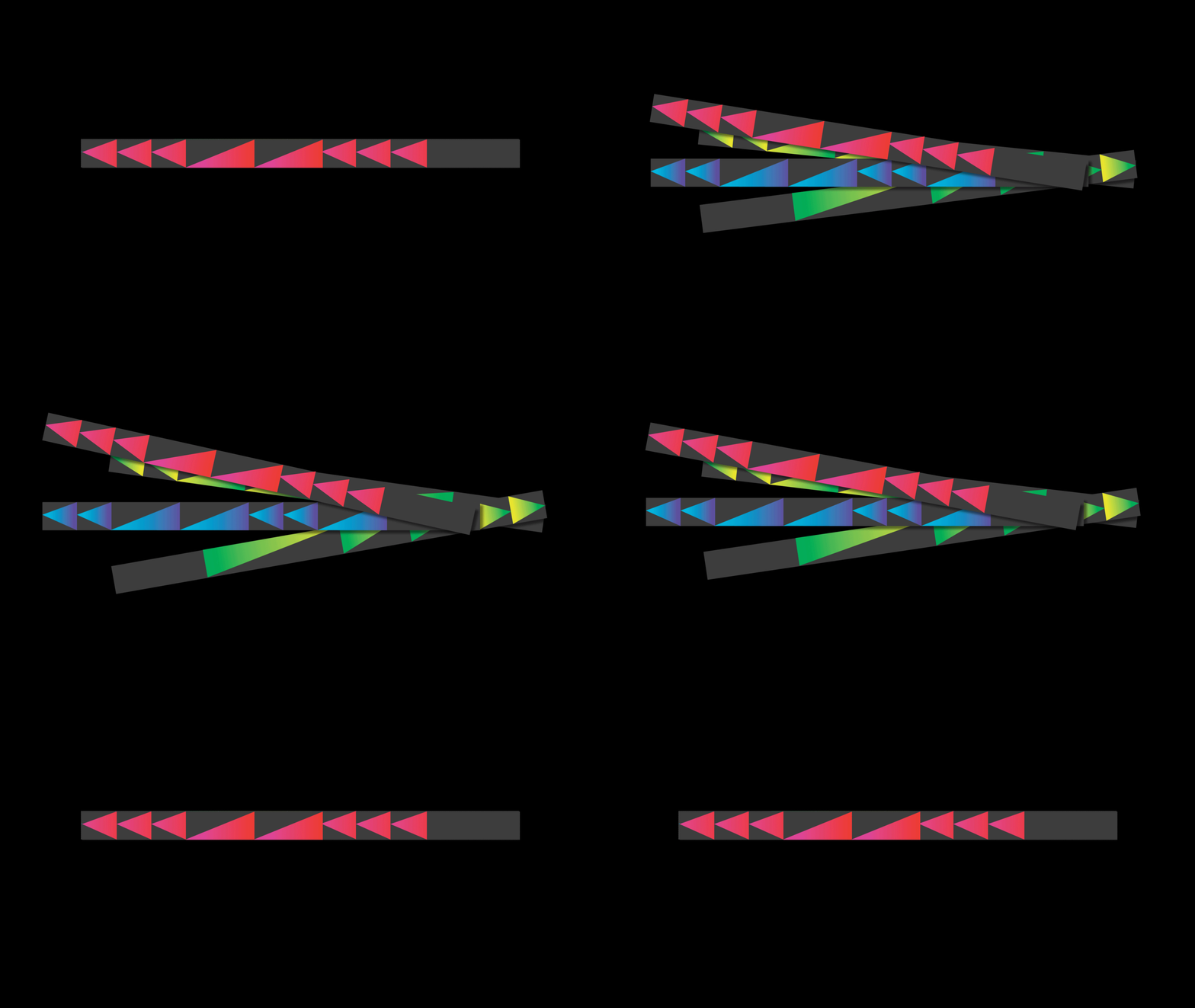
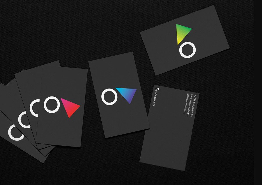
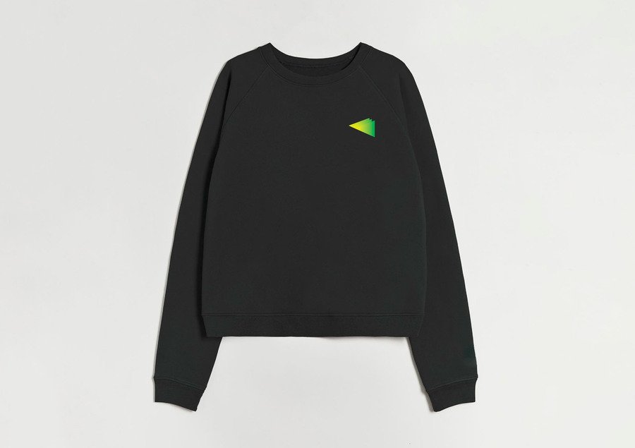
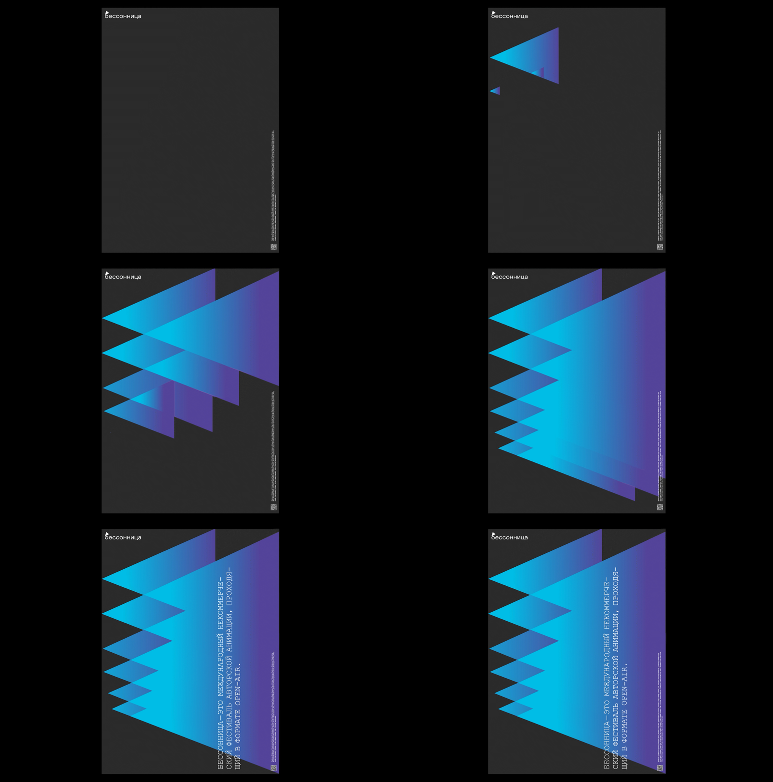
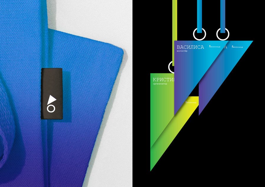
Insomnia Festival visual identity
Insomnia Festival visual identity
#02: Sukhovey
Sukhovey is a concept brand of freeze-dried food for solo hikers. Inspired by the landscapes of Kalmykia, nomadic culture and the openness of the steppe, the project explores the relationship between a practical travel product and the experience of an independent journey.The Challenge
The challenge was to give the product a distinctive character that connects with solo hikers. The identity needed to bring together the convenience of compact food and the sense of space, freedom and self-reliance associated with travelling alone.The Approach
I focused on the product’s transformation: it becomes compact for the journey, then expands into a meal when needed. This contrast between compression and expansion became the central metaphor, connected to the openness of the surrounding landscape.The Identity
The visual system explores compact forms and open space through graphics and typography. A restrained palette and textured surfaces give the presentation a tactile quality, reinforcing its connection to the physical experience of travel.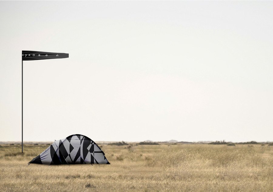
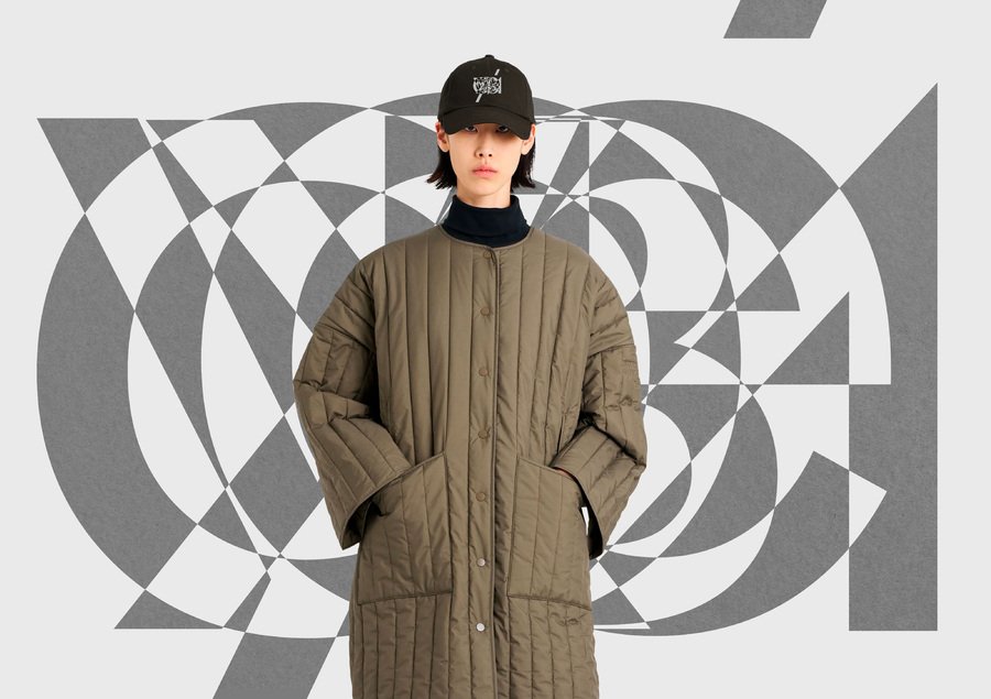
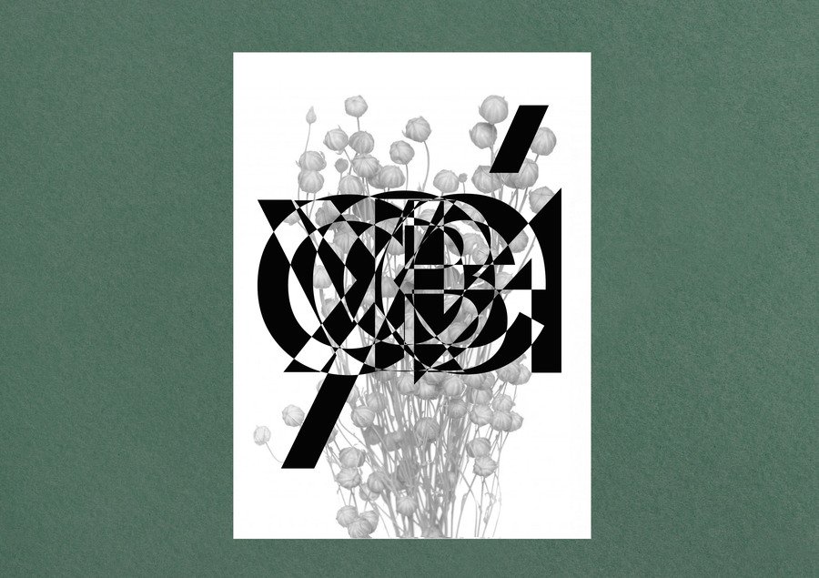
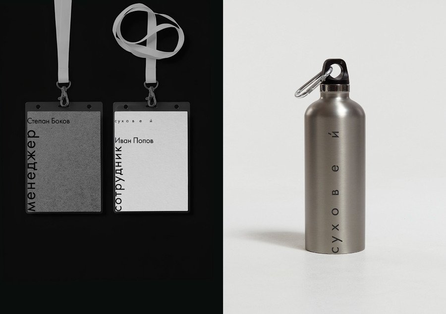
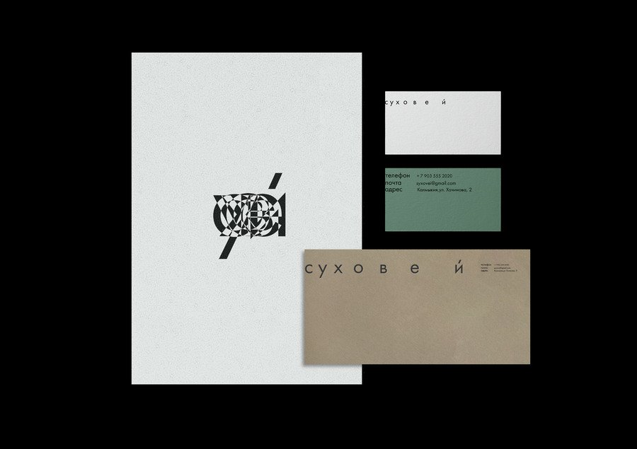
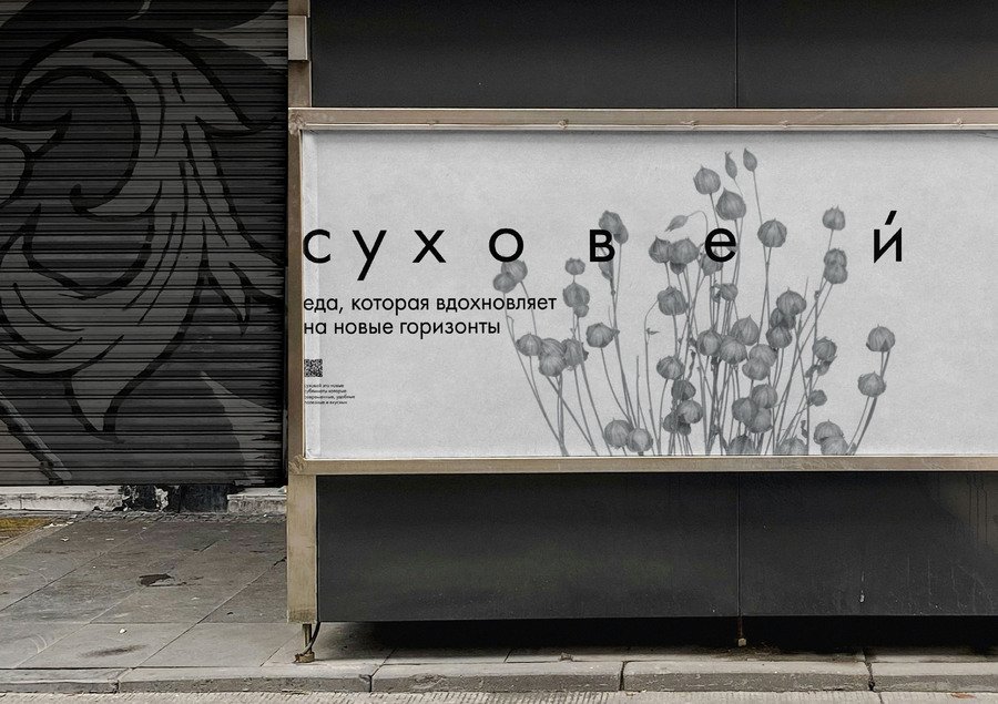
Sukhovey visual identity
Sukhovey visual identity
#03: Verite
Verite is a concept jewellery brand featuring natural stones and playful accessories. Its character centres on small acts of self-expression: adding colour, a little boldness and a sense of childhood play to everyday life.The Challenge
The challenge was to express this playful attitude through a recognisable identity. I wanted to allow spontaneity and individuality while ensuring that different compositions still felt like parts of the same brand.The Approach
Scattered childhood beads became the starting point: colourful, slightly naive and open to rearrangement. I translated this image into circular shapes and letterforms that could be combined in different ways.The Identity
Colourful circles, patterns and loosely arranged letters form a flexible graphic system. Their recurring shapes create continuity, while changing arrangements express the brand’s invitation to play and be yourself.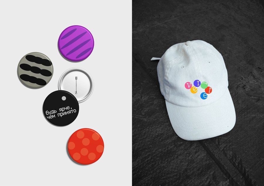
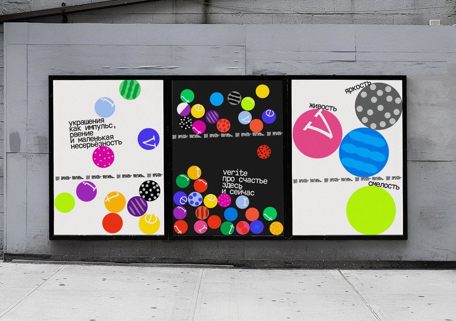
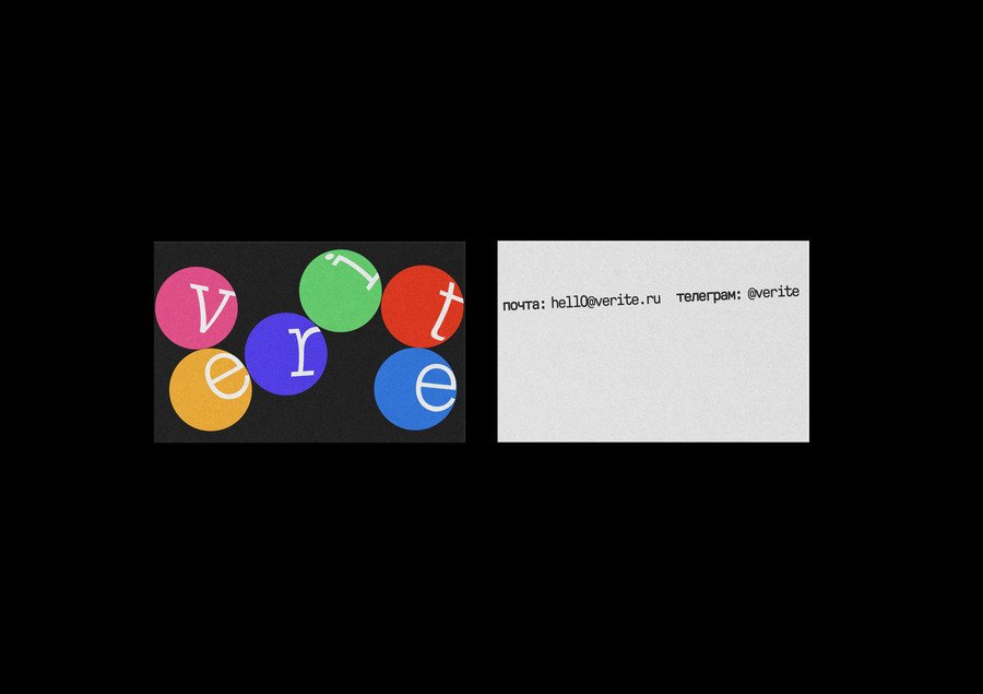
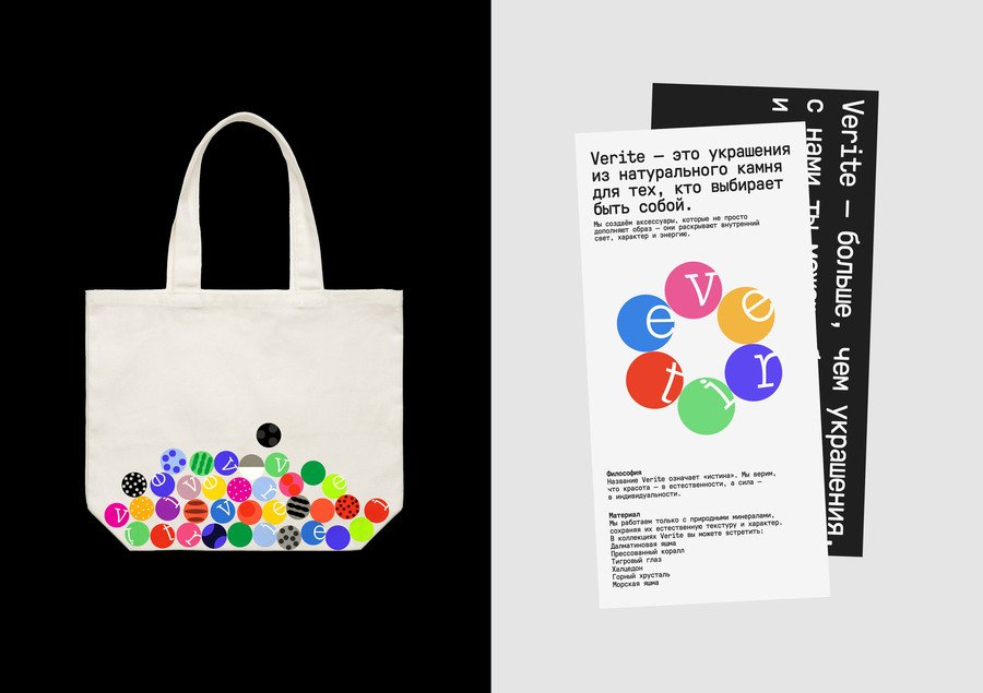
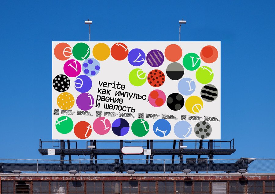
Verite visual identity
Verite visual identity
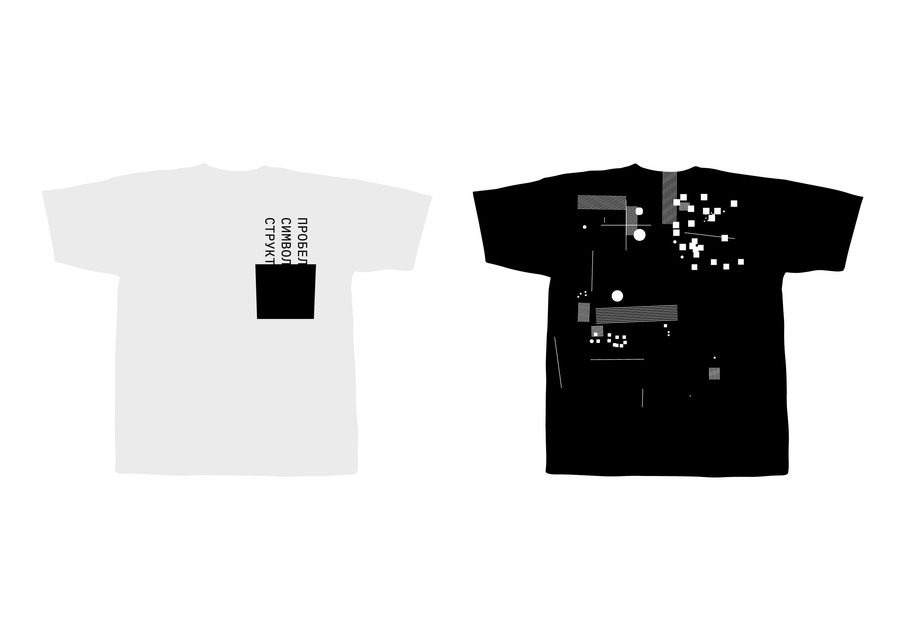
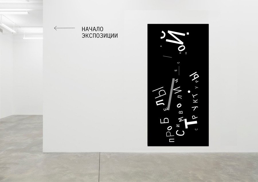
#04: Gaps in the Symbolic Structure
This exhibition concept explores the relationship between contemporary art and institutions. A garage space with a basement is conceptually divided into the permitted and the excluded. The visual identity extends this spatial and conceptual division into the exhibition’s communication.The Challenge
The challenge was to make an abstract relationship visible through graphic design. The identity needed to communicate the tension between artistic expression and institutional restriction while remaining usable across exhibition materials.The Approach
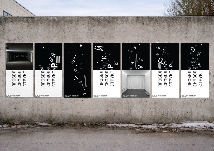
I translated the division of the exhibition space into a composition split into two equal halves. The same typographic material appears under different conditions, revealing how intervention can change its form and readability.The Identity
The lower half remains stable and readable, while the upper half becomes distorted and fragmented. This contrast turns typography into a visual expression of interference and provides a consistent rule for the identity.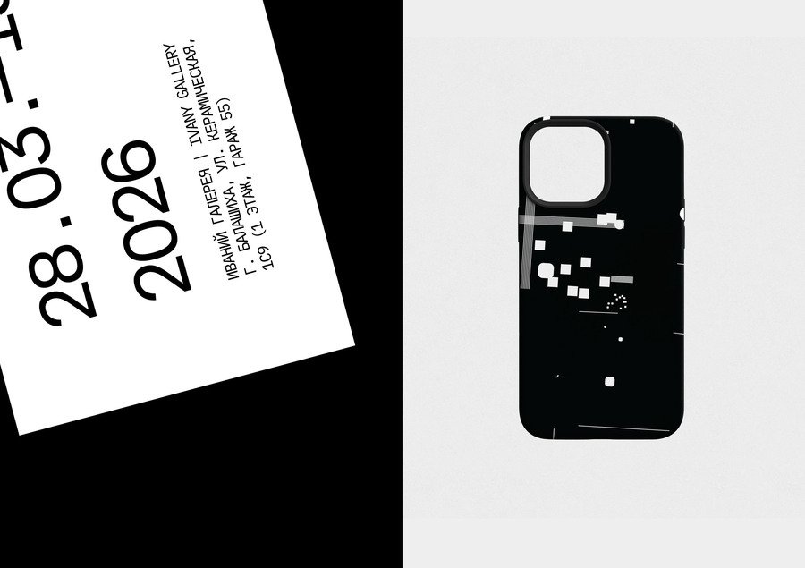
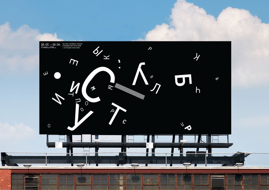
Gaps in the Symbolic Structure visual identity
Gaps in the Symbolic Structure visual identity
#05: Botanical Greenhouses
Botanical Greenhouses is a multifunctional cultural space within a historic estate. It brings together exhibitions, talks, events and a café. This student project develops a visual identity for the space and its varied programme.The Challenge
The challenge was to unite these activities within one recognisable identity while allowing individual events to retain their own character. The system also needed to help visitors distinguish between different programme areas.The Approach
I used the idea of an ecosystem under one roof. The roof became a recurring graphic element and the basis of a shared framework that could accommodate different kinds of content.The Identity
Posters combine a consistent roof motif at the top and a partner area at the bottom with a flexible central section. Colour distinguishes programme areas, while imagery, patterns and sculpted objects introduce variety within the shared structure.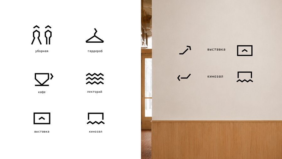
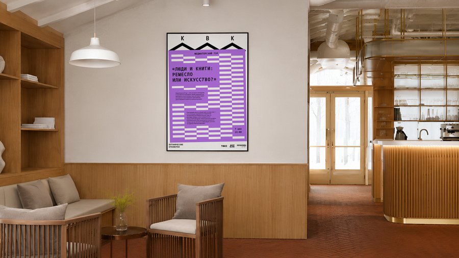
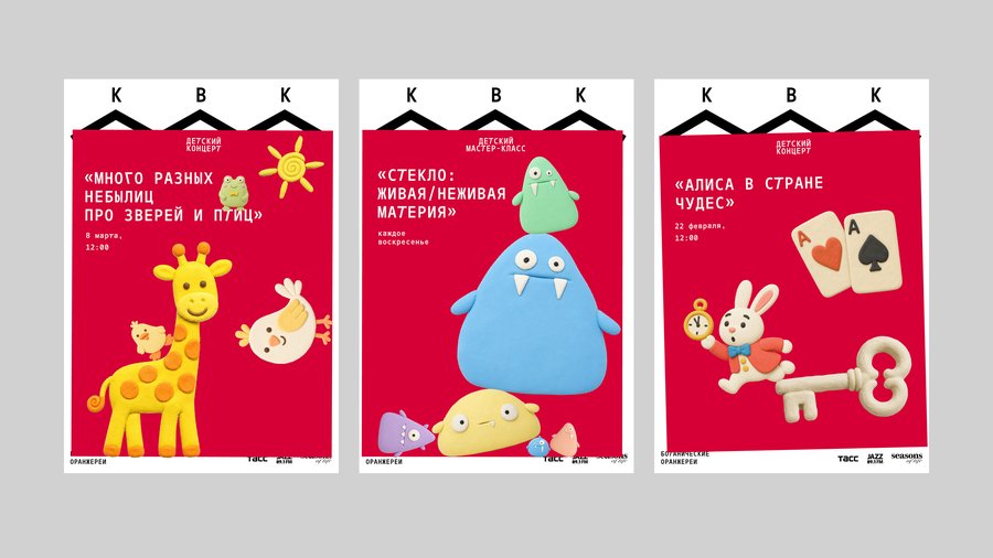
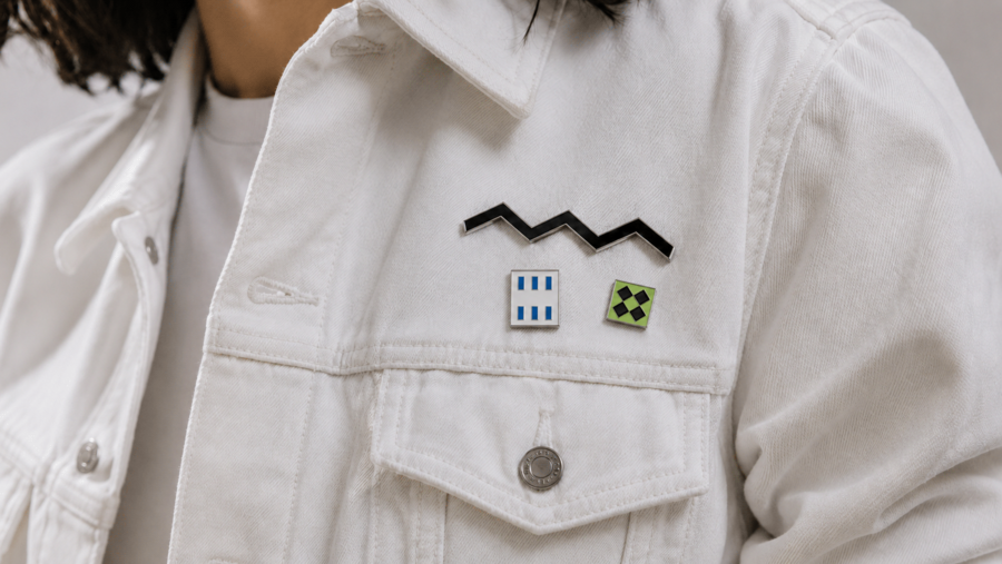
Botanical Greenhouses visual identity
Botanical Greenhouses visual identity
My approach
Finding the idea is the part of design I enjoy most. I like to spend time with a subject: understanding its context, asking questions and exploring connections before deciding what it should look like.I often look for a metaphor that captures something essential about the brand. It becomes a starting point for typography, colour, composition and imagery, giving the visual identity a shared logic.I want to understand why a visual choice belongs to a particular project. That depth of exploration helps me create work that feels specific, thoughtful and expressive.
Let’s Work Together
Have a project in mind? I’d love to hear about it. I’m open to branding projects and creative collaborations with independent brands, cultural organisations and fellow creatives.Get in touch to discuss your idea or explore how we could work together.Email — kosstyukova.00@gmail.com Telegram — @kosstukevich Dprofile — https://dprofile.ru/kosstyukova