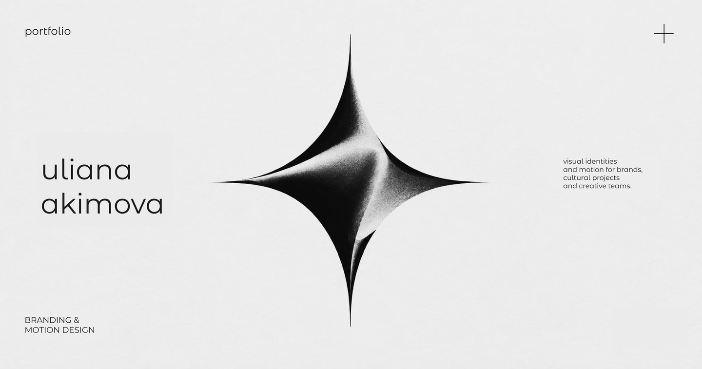
Ulyana Akimova
Communication Designer · Branding & Motion Design
Visual identities built around meaningful ideas.
I develop visual identities for brands, cultural organisations and creative projects, combining branding with motion design. My approach starts with finding a core idea, symbol or visual metaphor that captures a brand’s character and becomes the foundation of a cohesive visual system.
I create brand identities, graphic systems and motion graphics, translating concepts into distinctive visual languages across digital and physical formats. I focus on the connection between meaning and form, making sure every visual element has a purpose.
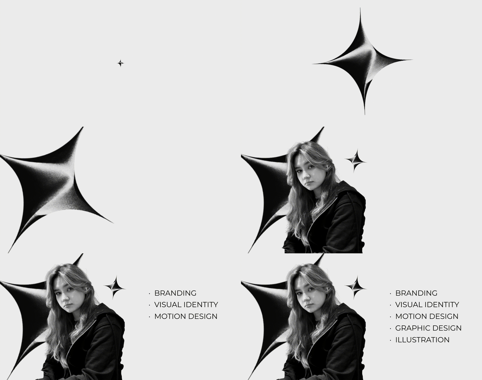
Focus: Branding, Visual Identity, Motion Design, Graphic Design, Illustration
Tools: Adobe After Effects, Illustrator, Photoshop, Figma, Blender
How I Work
Every visual system starts with an idea.
I begin by understanding what a brand stands for, what makes it distinctive and what it needs to communicate. I look for a key idea, symbol or visual metaphor that can express its character and guide the design process.
From there, I develop a visual system through typography, colour, composition and graphic elements, exploring how the concept can evolve across different formats. Motion adds another layer, bringing visual elements to life and creating new ways to communicate the idea.
The result is more than a collection of visuals: it is a consistent visual language with a clear concept behind it.
Case 01 | Russian Square. Palekh. Flax.
Brand Identity · Graphic Design · 2026
The ChallengeHow can traditional Russian visual culture be reinterpreted through a contemporary design language? The project explores the connection between Palekh’s artistic heritage and flax as a natural material, translating these references into a coherent and recognisable brand identity.
The IdeaThe seed became the central visual metaphor of the project — a symbol of origin, growth and transformation. It connects the natural qualities of flax with the idea of cultural heritage evolving into a new visual form.
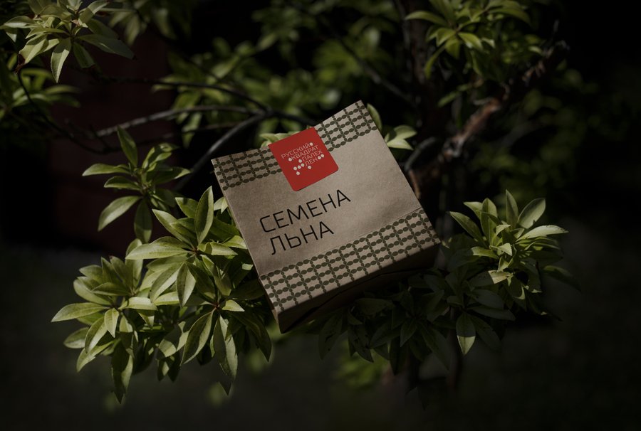
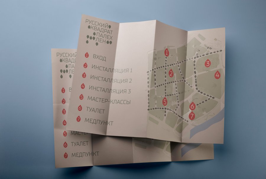
The SolutionThe identity was developed around the structure of the seed, which became the foundation for the logo and the wider graphic system. A considered colour palette and a set of patterns extend the central concept across the brand’s visual elements, creating a consistent language that combines references to tradition with a contemporary graphic approach.
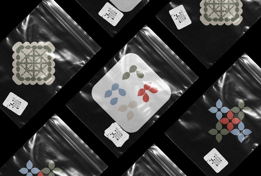
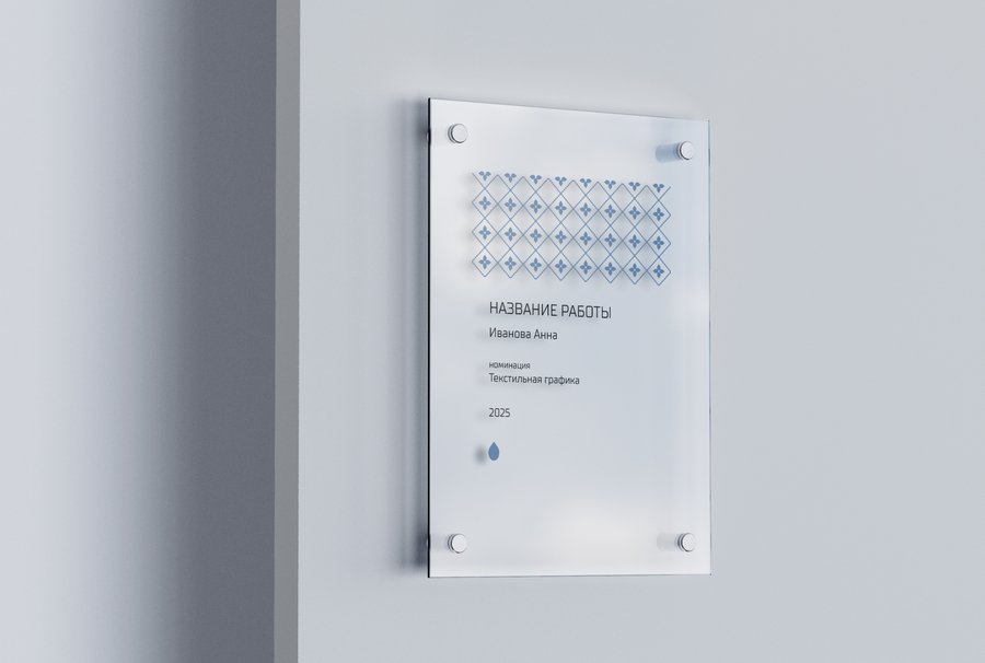
The Result
A cohesive visual identity built around one central idea. The seed connects the project’s concept, logo, colours and patterns into a unified system, showing how cultural references can be reinterpreted through contemporary branding.
Case 02 | ARTMOSPHERE
Rebranding · Visual Identity · Motion Design · 2026
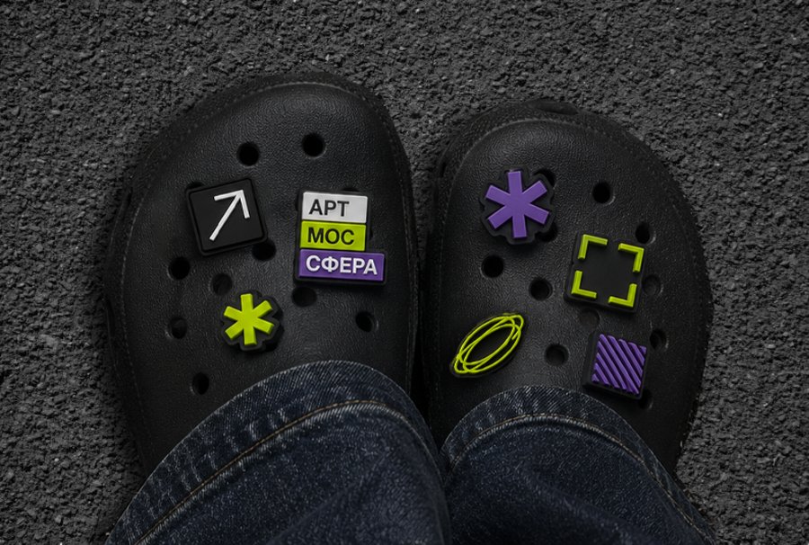
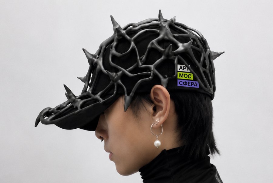
The ChallengeARTMOSPHERE is an international street art biennale exploring the relationship between artists, cities and society. Despite its strong curatorial identity, each edition had its own visual style, making it difficult for the festival to establish a consistent and recognisable image beyond individual events.
The IdeaThe name became the foundation of the new identity. Divided into three elements — ART, MOS and SPHERE — it represents the three participants in the festival: the artist, the city and society. Their interaction forms a visual metaphor for the dialogue between art and the urban environment.