IKEA Food’s Communication Strategy: The Case of Meatballs
We decided to examine the application of communication theory in the field of design development using a practical case to gain a more detailed understanding of the topic.
IKEA Food is an integral part of IKEA’s brand ecosystem and serves a strategic communicative function. The spatial structure of IKEA stores presupposes a long, guided route through thematically organized zones, making the shopping process physically and time-consuming. The integration of dining areas directly into the retail space emerged as a solution to this issue, while simultaneously strengthening the emotional connection between the customer and the brand.
The food offered within IKEA Food conceptually extends the core values of the IKEA brand: simplicity, a sense of comfort, and references to Swedish cultural identity. The most concentrated expression of these principles is found in the brand’s iconic meatballs, which have become a recognizable symbol of IKEA.
Over time, IKEA expanded the communicative potential of this product by moving meatballs beyond the restaurant format. The introduction of ready-to-cook products for home preparation, followed by the expansion of the range to include chicken and vegan options, allowed the brand to address a broader audience and strengthen loyalty among consumers with diverse dietary and ethical preferences.
Within one advertising campaign, IKEA combined its meatballs with its distinctive visual language developed for assembly instructions. By relinquishing exclusive control over the recipe, the brand transformed it into a medium of communication: the act of cooking according to IKEA’s instructions became a form of everyday interaction between the user and the brand.
In 2025, this logic was further developed in a designer collection in which meatballs functioned as a form-generating element, for example in the design of a plate specifically created for them. Additionally, within a local campaign in Singapore, the iconic meatballs were reimagined as soft keychains, demonstrating the brand’s ability to transform a gastronomic object into an emotional and souvenir-like sign.
Based on the above, the following theories from the course are applicable to this case:
Dialogic Theory (Kent & Taylor) IKEA Food structures its visual communication as an ethical dialogue, creating a sense of trust-based and equal interaction through simplicity and a caring aesthetic.
Affordance Theory (Gibson; Norman) The design of IKEA Food establishes intuitive interaction scenarios, visually communicating accessibility, simplicity, and readiness for use.
Relationship Management Theory (Ferguson; Ledingham & Bruning) IKEA Food builds long-term relationships with consumers through repeatable rituals and emotional engagement rather than direct advertising.
Narrative Paradigm (Fisher) IKEA Food employs a visual narrative of Scandinavian comfort and everyday simplicity as a persuasive form of brand storytelling.
Based on our observations and conclusions from these theories, we developed values for our brand. First and foremost, we aimed to make the brand accessible, comfortable, and relatable to our customers on a daily basis.
Presentation for general audience
WORK WITH THE LITTLE UNKNOWNS!
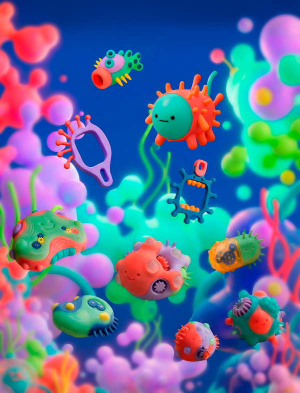
MICRODUDES — friendly pet-microbes for your working space!
MICRO-HUG Collection of anti-stress fidgets
Suitable for adults and children, helps cope with stress at school and work!
Blind-Box Packaging
Advertising poster
CARDHOLD-DUDES Collection of bright cardholders
Keep all the necessary cards — school passes, work passes, travel passes — at hand!
BLOBINATOR Collection of Pen Holders
Helps to organize your workspace!
MICROBEL Collection of Cabel Protectors
Protects your wires from damage!
Advertising posters
Presentation of your brand for a professional audience: Visual identity and values
Our brand values are:
— Openness — Comfort — Accessibility — Relatability — Fun
Variation of logotype
Brand’s Pallete
Reference promt for our objects' design
Design of a 3D-printed minimalistic /your object/.` Inspired by bacteria, virus, protists, diatoms, radiolarians. Emphasize strange geometries and use clean simplyfied forms.
The model must be optimized for dual-material 3D printing, combining translucent and opaque filaments in a single print.
Color palette is strictly limited to: #F24150 (bold coral-red) #AD82D9 (mystical lavender) #79D9C7 (luminous aqua) #A7D979 (vibrant lime green) #F8E15D (sunny golden yellow) #384698 (deep cosmic blue)
Optimize the model for multi-material FDM or resin printing, ensuring printability, stability, and delicate detailing that honors the strangeness and elegance of the microscopic realm.
Think «microbe meets modernist design”—a functional object that feels alive, yet perfectly at home on a minimalist desk.
Product package from different sides
Communication theory as basis for the presentation
The presentation of MICRODUDES brand—an accessible collection of office organizers and anti-stress fidget objects for children and adults—was directly shaped by the communication theories discussed in the course. Rather than functioning as a purely visual or commercial pitch, the presentation was conceived as a communicative system aimed at making the brand feel comfortable, relatable, and integrated into everyday life.
First, Dialogic Theory (Kent & Taylor) influenced the overall tone and visual language of the presentation. Instead of addressing the audience in a promotional or authoritative manner, the slides were designed to simulate a dialogue with the user. Simple wording, friendly visuals, and an absence of technical jargon created a sense of equality between the brand and the audience. This approach reinforced the idea that the products are not «designed for» users from a distance, but rather created with an understanding of their daily routines, stress, and needs. As a result, the brand presentation communicated openness, empathy, and accessibility.
Second, Affordance Theory (Gibson; Norman) played a key role in how both the products and their presentation were structured. The objects were shown in a way that made their use immediately legible: fidget elements invited touch, organizers suggested order and calm through their form, and visual layouts clearly indicated how the objects function in real situations. Similarly, the slides themselves were intuitive and uncluttered, allowing viewers to understand how the products work without excessive explanation. This strengthened the perception of the brand as easy to use, non-intimidating, and suitable for everyday life.
Third, Relationship Management Theory (Ferguson; Ledingham & Bruning) informed the strategic framing of the brand within the presentation. Rather than emphasizing single purchases or product features, the presentation highlighted long-term use, routine, and emotional comfort. The brand was positioned as a quiet, reliable presence in daily work or study environments—something that supports focus, reduces stress, and builds trust over time. This approach shifted the focus from short-term persuasion to the creation of ongoing relationships with users.
Finally, Walter Fisher’s Narrative Paradigm shaped the overall structure of the presentation. Instead of relying on abstract arguments about productivity or stress reduction, the presentation followed a visual narrative of everyday life: moments of work, distraction, fatigue, and relief. The organizers and fidget objects appeared as natural elements within this story, reinforcing the idea that comfort and accessibility are not luxuries, but small, achievable parts of daily routines. This narrative coherence made the brand feel believable and emotionally resonant.
In conclusion, applying communication theory allowed the presentation to become more than a showcase of objects. It became a coherent communicative experience in which design, narrative, and user perception worked together to express the brand’s core values of accessibility, comfort, and relatability.
Материалы курса «Communication Theory: Bridging Academia and Practice» // HSE URL: https://edu.hse.ru/course/view.php?id=133853 (дата обращения: 10.12.2025).
Seow Ting Lee «A user approach to dialogic theory in a Facebook campaign on love and marriage // Media, Culture & Society. — 2014. — №Vol. 36(4). — С. 437–455.
Francesca Cabiddu, Manuela De Carlo, Gabriele Piccoli Social media affordances: Enabling customer engagement // Annals of Tourism Research. — 2014. — № 48. — С. 175–192.
The entire brand visual was created by the project’s authors using neural networks.


