Целью проекта является создание айдентики для бренда молочных продуктов из Вологды с помощью нейросетей. Данная работа демонстрирует то, как искусственный интеллект может преобразовать уже существующий проект, изменив его айдентику и добавив дополнительные детали.
О ПРОЕКТЕ
«О!» — бренд молочных продуктов из Вологодской области, создающий новые семейные традиции. В основе айдентики лежит вологодский говор, поэтому буква «о», выведенная ножом по маслу, становится основой коммуникации.
Ссылка на проект: https://portfolio.hse.ru/Project/223480
Концепция проекта предполагает создание пространства, а также промо-материалов и айдентики с применением нейросетей.
РЕБРЕНДИНГ С ПОМОЩЬЮ AI
В ходе разработки проекта я использовала такие ресурсы, как СhatGPT, Ideogram, MyFonts и Leonardo Diffusion XL. Генерации логотипа выполнена с помощью нейросети ideogram, а поиск шрифтового решения—MyFonts.
Промты сгенерированы в чате GPT по запросам и описанию необходимого изображения и деталей на нем: что будет на изображении, в каком стиле, палитре, ракурсе, освещении.
АЙДЕНТИКА
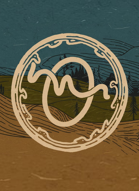
ЛОГО
Первым этапом я создала Prompt для генерации логотипа моей вымышленной компании в чате GPT 4. Полученный Promt я вставила в нейросеть.
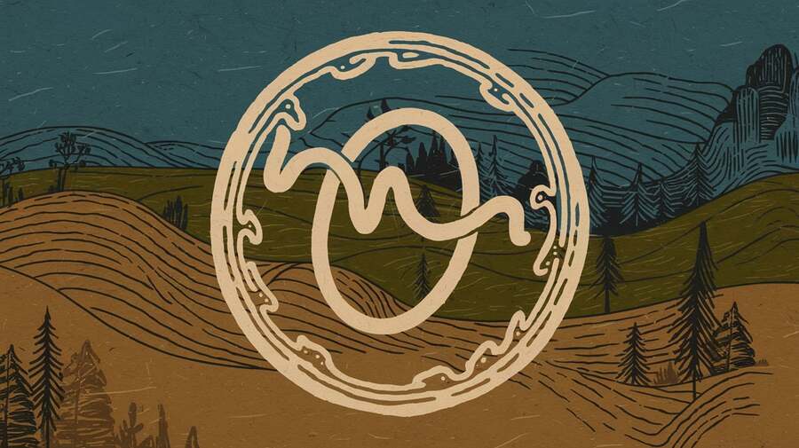
Promt: The logo is a hand-drawn, fluid «O» with a stylized, wavy line inside it. The line has peaks and valleys, representing the natural imperfection and chaos. The letter «O» is placed within a circle made of irregular, hand-drawn lines. The circle is placed on a backdrop of the Vologda region’s landscape, with rolling hills, trees, and a body of water. The overall design has a rustic, organic feel. A palette of earthy tones: a warm beige for the «O», a deep green for the circle, and a rich blue for the background landscape. The beige and green are used to create a textured, hand-drawn effect on the «O» and the circle. The blue is used for the background landscape, which contains rolling hills, trees, and a body of water.
ЦВЕТА
Цветовую палитру я создала в Adobe Color. Я использовала встроенную нейросеть для распознания оттенков в полученном логотипе.
В создании палитры помог Adobe color
ТИПОГРАФИКА
Для выбора шрифта я использовала MyFonts, я использовала встроенную нейросеть для распознания шрифтов в полученном логотипе.
Концепция проекта предполагает создание пространства, а также промо-материалов и айдентики с применением нейросетей.
УПАКОВКА
Promt: Milk cartons, several of varying fat content (3.2%, 2,5%, 1,5%) and butter. The packaging should feature a logo: a hand-drawn, flowing letter «O» written in Pasta Script Spaghetti font with a stylized wavy line inside. The line has peaks and valleys, representing natural imperfection and chaos. An earthy palette including a warm beige, deep green rich blue.
ПРОМО-МАТЕРИАЛЫ
Promt: Photo of a billboard advertising a dairy brand. The billboard features a hand-drawn, flowing letter «O» written in Pasta Script Spaghetti font, with a stylized wavy line inside. The line has peaks and valleys, representing natural imperfection and chaos. The brand colors are a warm beige, deep green, and rich blue. The billboard is placed in a rural setting, with rolling hills and trees in the background. There’s a cow in the foreground, grazing near the billboard.
Promt: A photo of advertising posters for a dairy brand. The posters have a hand-drawn, flowing letter «O» written in Pasta Script Spaghetti font with a stylized wavy line inside. The line has peaks and valleys, representing natural imperfection and chaos. The brand colors are a warm beige, deep green, and rich blue.
ТРАНСПОРТ
Promt: A truck with painted in an earthy palette of warm beige, deep green, and rich blue. The logo features a hand-drawn, flowing letter «O» written in Pasta Script Spaghetti font, with a stylized wavy line inside. The line has peaks and valleys, representing natural imperfection and chaos. The logo is placed on the side of the truck.
ПРОСТРАНСТВО
Promt: An interior space for a store for a dairy brand. The space has a minimalist design with an open layout, featuring natural materials such as wood and stone. There are uneven shelves and hand-crafted displays, celebrating natural asymmetry. The walls have exposed brickwork. The floor has a rustic texture. The lighting is soft and warm. There is a tasting station in the corner. The overall atmosphere is inviting and warm, reflecting the brand’s values of authenticity and simplicity.
Используемые инструменты
В проекте были использованы следующие нейросети и сервисы:
𝗖𝗵𝗮𝘁𝗚𝗣𝗧 — генерация промтов, 𝗜𝗱𝗲𝗼𝗴𝗿𝗮𝗺 — генерация логотипа, шрифтового решения, упаковки, носителей, 𝗠𝘆𝗙𝗼𝗻𝘁𝘀 — распознавание шрифта, 𝗟𝗲𝗼𝗻𝗮𝗿𝗱𝗼 𝗗𝗶𝗳𝗳𝘂𝘀𝗶𝗼𝗻 𝗫𝗟 — генерация плакатов.


