О проекте
В проекте по «Базовому курсу коммуникационного дизайна» мною была создана концепция образовательного детского лагеря, обучение в котором проходило в игровом формате взаимодействия с воздушными змеями. В качестве продолжения идеи я разработала стартап-проект «KiteMind» — уже не просто лагерь, а образовательно-исследовательский хаб и бренд, посвященный совмещению современной науки и культуры воздушных змеев; сообщество энтузиастов, инженеров, художников и экологов, объединенных идеей переосмысления древнего изобретения в контексте современности.
Мудборд и примеры плакатов предыдущего проекта.
Ребрендинг
Логотип
Create a modern and vibrant logo for a brand called 'KiteMind'. Use a geometric kite shape composed of four triangular segments in orange, yellow, red, and blue. Place the brand name 'KiteMind' below.
Шрифт
Цветовая палитра
Объекты
общий промпт для объектов:
Generate a realistic product visualization for the educational brand «KiteMind».
Style: Clean, minimal, educational product design. Not futuristic, not toy-like. Feels like a real, purchasable product.
Materials: Natural and functional — fabric, wood or bamboo, lightweight rods, recycled plastics, metal connectors.
Color palette: Warm neutral base with subtle accents of cobalt blue, sun yellow, terracotta red.
Composition: Clear product focus, organized layout. Studio or soft natural lighting. Neutral background.
Mood: Intelligent, approachable, research-oriented.
Output: High-quality, realistic product image suitable for a website or catalog.
частный промпт для доделывания левого изображения: Three «KiteMind» kits — Beginner, Intermediate, Advanced — displayed side by side on a warm beige surface. Each features the same cylindrical kraft tube with logo, but contents scale in complexity: Beginner has basic fabrics and rods; Intermediate adds patterns and tools; Advanced includes camera, sensors, and technical schematics. All elements are arranged in flat lay, shot from a 45-degree angle, with soft studio lighting and subtle shadows. Style: minimalist, tactile, educational»
частный промпт для доделывания левого изображения: Photorealistic mockup of a «KiteMind Advanced» kit: cylindrical kraft tube with logo, opened to reveal a compact action camera mounted on a carbon fiber rod, weatherproof fabric panels, GPS sensor, and a data log booklet. Components lie beside the tube on a warm beige surface under soft directional light. Emphasize precision, technology, and durability — while retaining the brand’s warm, approachable aesthetic.
Плакаты
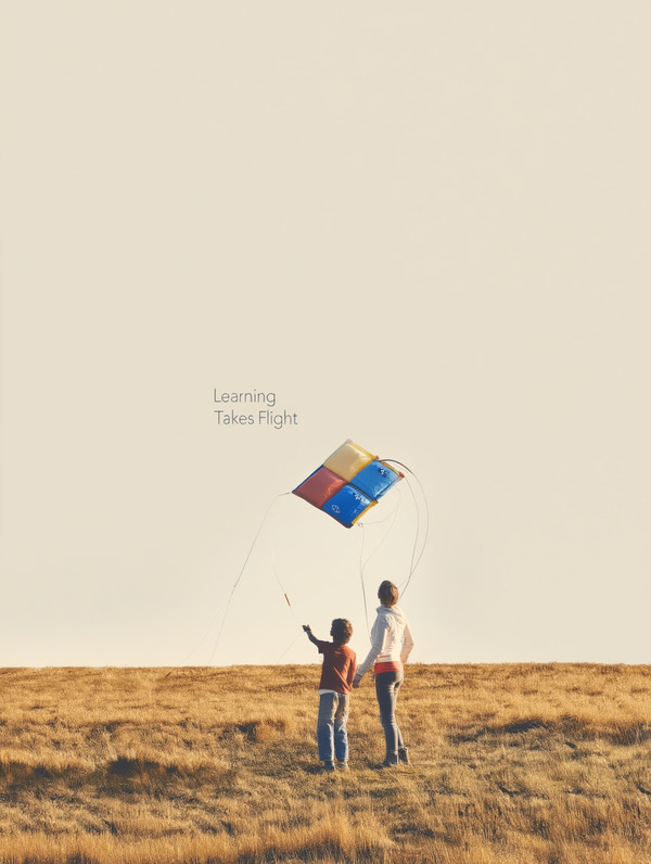
Two people. Small kite flying high above a wide open landscape // Detailed tactile view of kite materials: organic fabric, bamboo rods, stitching, knots. Natural outdoor background.
Modular kite components arranged as a system: rods, fabric panels, connectors, electronics// Abstract poster made of geometric kite shapes and flowing wind lines. Flat graphic design, no photorealism.
общий промпт: Generate a high-quality vertical poster images for the educational innovation brand «KiteMind». All posters must belong to one consistent visual system.
GLOBAL STYLE (apply to all images): — modern editorial design — calm, intelligent, optimistic mood — minimal composition, clear focal point, negative space — soft natural or studio lighting — eco-educational and research-oriented aesthetic — consistent color system: warm beige / soft grey base with accents of cobalt blue, sun yellow, terracotta red — modern geometric sans-serif typography, subtle and secondary — professional poster quality, high resolution
OPTIONAL TEXT OVERLAY: «Learning Takes Flight» / «Designing with the Wind» / «Thinking Through the Air»
ASPECT RATIO: Vertical poster.
Пространство
общий промпт: Generate a photorealistic interior view of the «KiteMind Hub» — a bright, airy, community-driven hybrid space blending workshop, lab, co-working zone, and showroom, designed with eco-conscious minimalism and patchwork warmth: reclaimed wood workbenches hold kite prototypes, bamboo rods, organic cotton fabrics in bold red/blue/yellow, and spools of thread; walls display a curated mix of traditional fabric kites and high-tech sensor-equipped models, some pinned mid-construction beside hand-drawn sketches; large industrial windows flood the room with natural light, filtered by sheer linen curtains, overlooking a grassy courtyard with a kite-testing field; a central collaborative table of recycled timber is surrounded by mismatched chairs — woven plastic, vintage stools — reinforcing social inclusivity; a cozy lounge zone features oversized bean bags and floor cushions in primary colors, next to a small library of books on aerodynamics and textile art; a digital wall shows real-time aerial footage from kite-mounted cameras alongside live wind data; textures include raw wood, unbleached canvas, jute rope, cork boards, and chalkboard walls with evolving notes; color palette: warm neutrals (oatmeal, clay, soft grey) accented with intentional pops of KiteMind’s signature cobalt blue, sun yellow, and terracotta red; mood: inviting, alive with quiet creativity — where children, scientists, artists, and engineers share tools, ideas, and skyward curiosity, all within a space built from honest materials and open exchange.
Процесс создания
Основным инструментом для генерации изображений был Reve: эта нейросеть использовалась для получения комплексных сцен и макетов, обеспечивающих единый визуальный стиль проекта, там же я создала логотип. Для отдельных продуктовых визуализаций и носителей фирменного стиля я применяла Microsoft Copilot, позволяющий сохранять элементы айдентики (логотип, цвета, шрифты) без изменений.
Все визуальные материалы я разрабатывала на основе системных промптов, подготовленных совместно с ChatGPT и Qwen. На этапе генерации промпты направлялись в нейросети для создания различных типов изображений: логотипа, продуктовых комплектов, постеров и интерьерных пространств.
Для повышения точности визуализации были взяты референсы (мокапы, графический дизайн плакатов, примеры пространств) с сервиса Pinterest, который дополнял промпты конкретными визуальными образами.
Дополнительно использовались сервисы Adobe Color и WhatTheFont для работы с палитрой и типографикой.


