Brand Promotion of SON
About SON
Human emotions are multifaceted, they arise against the will of a person, generate specific feelings and are often too complex to be aware of them.
Synth Of Neuro (SON) is an online service that helps people express and reveal what they feel, work through and concretize each emotion, and understand themselves. A company based on psychological and emotional support through sound and music.
Do you find it difficult to understand your feelings and even more difficult to express them? Can’t you fully experience what you feel? Do you need help expressing your feelings and emotions? Our company will help you live the most complex and multifaceted feelings and emotions. We are based on creating sound and music aimed at relaxing, calming, and releasing everything that has accumulated inside.
Communication theory in the field of design
Communication theory in design explores how visual, textual, and interactive elements convey meaning and elicit desired reactions from the audience. She examines the key components of a visual message: the author (designer), the recipient (user or viewer), the signs and symbols used, the chosen channels of information transmission — from printed media to digital interfaces — as well as how context affects perception.
In this area, both verbal and non-verbal means are important: form, color, composition, typography, movement, and sound. Communication theory in design helps to understand how to create understandable, logical and emotionally expressive solutions, eliminating potential barriers to perception and making interaction with the product more intuitive.
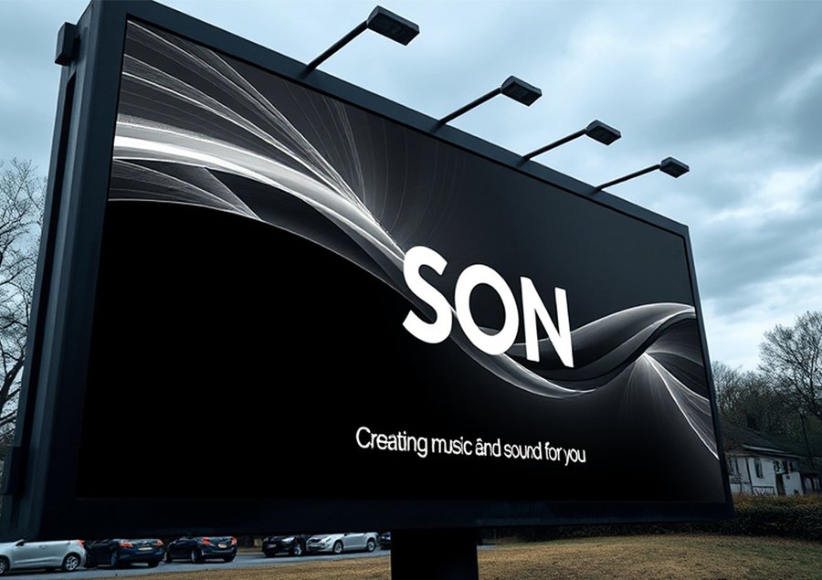
SON poster on the street
Various communication theories provide designers with valuable tools to create more meaningful and convincing solutions. For example, semiotics, the science of signs— helps us understand how shapes, colors, and symbols create meaning and evoke certain associations. Using a semiotic approach, designers can build visual systems that clearly convey ideas and help the user navigate the interface or brand faster.
Narrative theories explain how stories form understanding and emotional connection. Designers can use storytelling in branding, interfaces, and presentations to make interactions more human and engaging. A well-structured visual narrative helps the user not only understand the functionality of the product, but also feel its value.
Thus, different communication approaches allow the design to be not just aesthetic, but deep, convincing and focused on the real perception and experience of a person.
The record
Pragmatic communication theories emphasize that meaning arises in the process of interaction, so design should not just demonstrate information, but guide user behavior. When interface or object elements «suggest» their functions—through shape, scale, material, or location—it’s easier for people to understand how to interact with them. Such natural prompts make the user experience smoother and more intuitive.
Socio-cultural approaches to communication remind us that the perception of design is always related to the context: norms, values, and habits of a particular group. This means that effective design must take into account the cultural codes, experiences, and expectations of the audience. When visual solutions reflect familiar images, gestures, or symbols, they evoke a sense of trust and intimacy.
Identity of the SON company
In general, all these theories show that successful design is not just a matter of aesthetics, but the result of a deep understanding of how people perceive, interpret, and use information. They provide designers with a wide range of tools, from the ability to shape brand identity through symbols and shared stories to the ability to create compelling messages that reflect audience values and guide their behavior.
Communication approaches help to think through visual and textual elements so that they work as a single, logical system: create understandable meanings, evoke emotions, explain functionality and improve the user experience. Storytelling enhances engagement and trust, semiotics helps to build clear iconic structures, perception theories provide clarity and convenience of interaction, and accessibility principles ensure that the product is intuitive and understandable for different people.
By combining these theoretical foundations, designers gain the opportunity to create solutions that not only meet the user’s needs, but also form a deeper, meaningful experience. As a result, communication in design becomes more accurate, humane, and effective, and design itself becomes a tool capable of building connections, guiding behavior, and creating value in a wide variety of contexts.
Presentation for a general audience
If you have trouble sleeping, or perhaps understanding your feelings and emotions, then you know how good it would be to understand yourself and help you get out of these states.
What if you had a system that would help you deal with all your feelings? Meet the SON platform. Music and sound that talks back.
The slogan
The point is not only that it is difficult to understand your feelings, to concretize them, but also that the mind can be affected by anxiety and fears.
A humans needs not only an understanding of their feelings, but also peace, an even tone of emotional state.
That’s why we made a SON. It’s not just a platform to help you deal with emotions, it’s your friend and helper, a guide to yourself.
The platform does not just select music and sound for your condition, it conducts a detailed analysis, adjusting to your specific features, building algorithms and recommendations in connection with your personal experience.
The online platform
And because everyone is different, we have created unique visual media that emphasize the company’s unified style, but tailored to each individual.
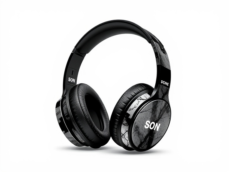
headphones from the SON company
So, what can SON actually do? It’s pretty simple.
Your guide to the world of sleep. On the website, you can choose the music and sound to suit your taste and condition.
It’s a physical presence. The company has developed physical media, the design of which can vary depending on the client’s wishes.
This is the listener. The musical and sound component is based on the individual user experience.
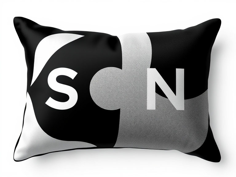
pillows of the SON company
Presentation brand for a professional audience
SON company office
The design uses three main colors: gray, white and black. These shades are chosen as neutral and not flashy, as one of the company’s key objectives is to create a favorable customer experience.
At the same time, it was important for us to use soft, muted colors, the same non-flashy shades, to create a friendly environment.
Maintaining visual harmony between all design elements has also become an important aspect. A neutral palette helps to focus on the content and functionality without overloading the perception with bright accents. This approach enhances a sense of stability, reliability, and accuracy, qualities that are especially valuable in communicating with clients.
In addition, the use of calm colors makes it easy to adapt the design to various formats and media, while maintaining the integrity of the brand’s image. The monochrome base makes it possible to add additional accent shades if necessary — for example, to highlight important elements or create thematic visual blocks — without violating the overall style.
Thus, the chosen color scheme not only reflects the company’s values, but also contributes to the formation of a comfortable, trusting atmosphere, making interaction with the brand more pleasant and natural.
design options that are used in the SON company identity
The SON company’s identity was created as an integrated visual system reflecting the calm, gentle and caring nature of the brand. It includes not only a seasoned color palette and thoughtful graphic elements, but also the corporate identity of the media, including business cards. They are made in a minimalistic design, with an emphasis on cleanliness, lightness and pleasant tactile sensations, which emphasizes the company’s attention to detail and the quality of interaction at all levels.
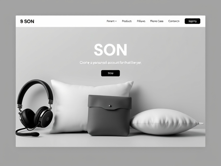
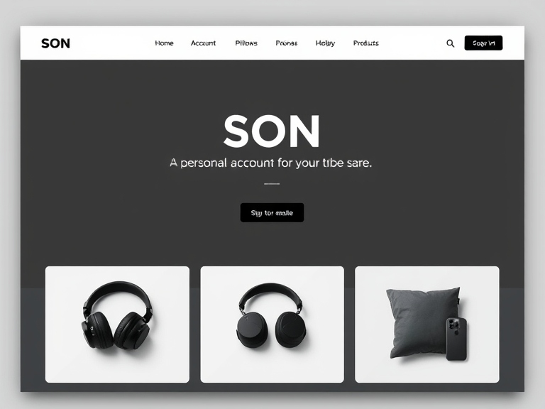
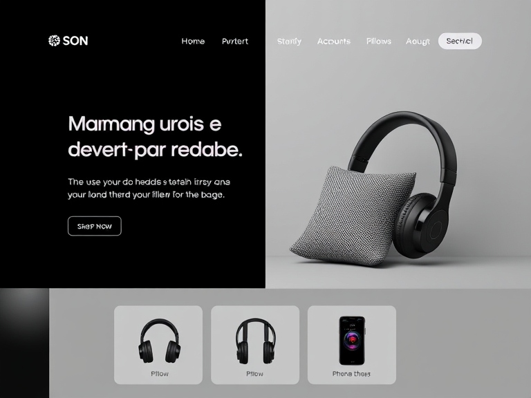
A special place in the identity is occupied by a specially designed website of SON company. It is designed in such a way that it is as convenient as possible for the user to select the necessary products, view the assortment and receive personal recommendations. The interface is designed in a calm, unobtrusive style, providing a comfortable experience and logical navigation.
online website of the SON company
In the personal account, users can customize not only the order parameters, but also the atmosphere of the site according to their preferences — choose music or soundtrack that creates a mood and enhances the feeling of comfort and relaxation. This makes the interaction with the brand more individual and emotionally meaningful.
SON company is attentive to the wishes of its customers: all reviews are analyzed, and suggestions for improvement are gradually being implemented into the service, product line, and digital solutions. This approach allows the brand to remain flexible, open and focused on the real needs of people, strengthening trust and forming a strong connection with the audience.
To develop branded products, our team also collaborated with experts in sleep and emotional well-being to create not just objects, but solutions that help people of any age relax more easily, cope with insomnia and live their emotions more environmentally friendly. We tried to ensure that each product became part of a personal relaxation ritual, created a sense of calm and contributed to a gentle transition from daytime activity to a state of relaxation.
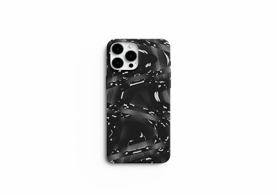
Our phone cases are designed as a visual reminder of the importance of balancing the digital environment and personal well-being. Their design helps you tune in to silence, reduce the level of overload, and gently switch from the screen to yourself. They become not just an accessory, but part of the habit of taking care of your inner state.
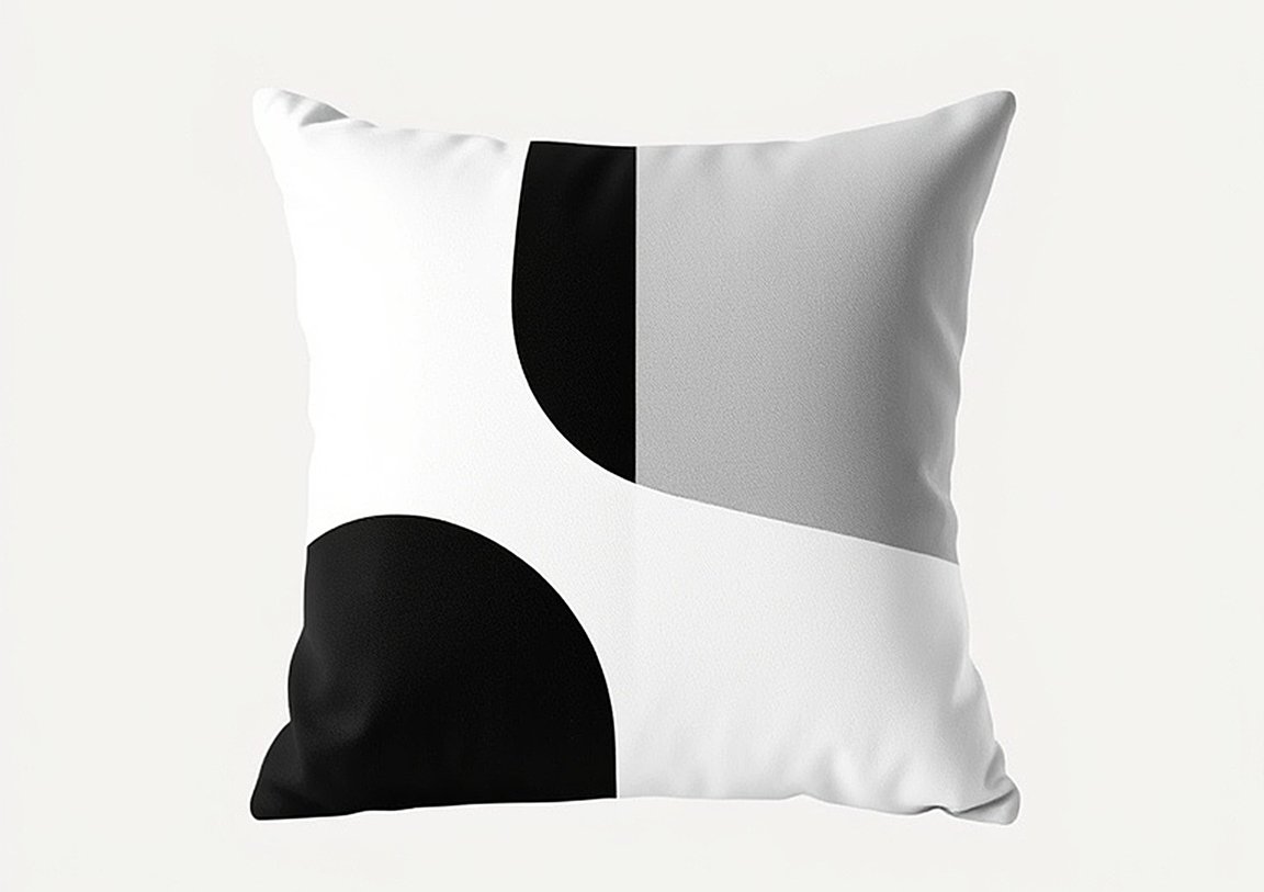
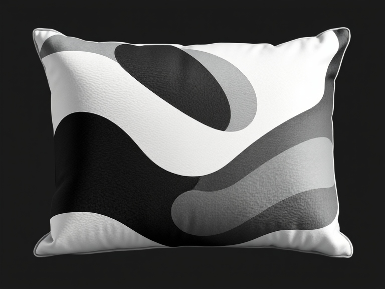
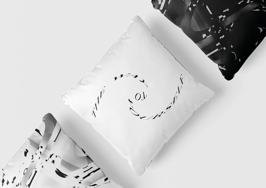
Branded pillows are designed to maintain a sense of comfort and safety. Soft materials, thoughtful shape and calm aesthetics help a person to relax, release tension and create a comfortable atmosphere for relaxation or meditation.
Branded products
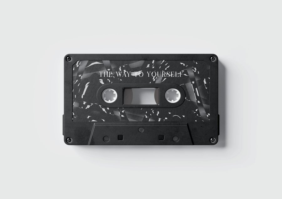
We paid special attention to records and audio cassettes. They provide an opportunity to disconnect from visual noise and immerse yourself in the world of sounds — calm music, meditative audio tones, or atmospheric sounds that help you experience emotions, become aware of feelings, and gently adjust to rest. This format replaces a bright screen, allowing a person to spend time with himself, in a more natural and calm rhythm.
Every element of our products is created with care for people and their inner harmonious state. We strive to make evening and personal rituals more conscious, gentle and supportive, helping to cope not only with sleep problems, but also with emotional overload, anxiety and fatigue.
Branded products
Communication theory as basis for the presentations
In two SON presentations, communication theories serve as the foundation for building a narrative, visual system, and user experience, forming a cohesive brand image and explaining its value through audience-understandable communication mechanisms. It is important to emphasize that SON works not only with sleep, but also with the emotional state of people, and therefore relies on theories that reveal the processes of perception, interaction and the formation of meaning.
The theory of symbolic convergence manifests itself in the creation of a common emotional space where SON forms a symbolic world of peace, restoration and inner harmony. Repetitive motifs — soft tones, familiar visual patterns, and auditory images — create a shared status story in which users feel they belong to a supportive and safe community. This bonding around a shared experience — recovery and emotional balance — reinforces a sense of identity and trust in the brand.
SON company office
The narrative paradigm is at the heart of how SON talks about himself and his products. The presentations are designed to guide the audience through a logical and emotionally fulfilling path: from understanding the problem (stress, insomnia, emotional overload) to showing a solution based on calmness, gentleness and conscious rest. Stories about sleep rituals, sound experiences, and personal habits of users help make the brand more human and trustworthy.
Rhetoric and persuasion manifest themselves in positioning SON as a practical and value-oriented solution. The problem is clearly defined — it is difficult for people to relax, recover and live emotions in conditions of overload. SON offers not just products, but a system of supporting tools: sound, visual language, atmosphere, rituals. In the presentations, the accents are placed so that the audience can see that SON enhances the quality of life, reduces stress and creates conditions for a healthy emotional background.
Logo
The theory of use and reward is reflected in how SON takes into account people’s real needs: the desire to reduce anxiety, find a beautiful and functional accessory, relax with music, create a ritual before going to bed, switch from screens. The presentations emphasize that SON does not compete with direct products, but with user habits — endless phone tape, environmental noise, stress. SON products provide a specific reward: clarity, calmness, aesthetic pleasure, a sense of caring and control over one’s own condition.
The final professional presentation emphasizes that the entire visual language of the brand — from the corporate palette to the design of the website and physical products — is designed to be intuitive, gentle and emotionally supportive. The sound solutions are designed to create a sense of personal audio space, and the interface structure makes it easy for the user to customize their relaxation ritual.
Together, these elements demonstrate that communication theories in SON are not abstract concepts, but working tools. They shape the brand’s narrative, define visual solutions, guide user interaction, and create a stable media ecosystem in which each element reinforces the basic meaning: a state of calm, emotional harmony, and respect for a person’s personal space.
The project is based on materials from the Communication Theory course.
All pictures are from Lyubov Klestova’s project https://portfolio.hse.ru/Project/173205
Pictures from Lyubov Klestova’s project made with Leonardo AI assistance: https://hsedesign.ru/project/7c73a11736d34921b416d988b2e5753b
