
General theoretical foundations of communication in the field of design
Modern design has long ceased to be just a visual reinforcement of the brand’ s character. Now it can be safely called a tool that helps to build communication with the consumer at the level be 0; aesthetic objects, symbolic and cultural associations, which become the non-verbal language be 1; the company be 2; product. Communication theory provides designers with be 3; number be 4; tools that help them better understand the audience and create be 5; optimal semantic message using symbolic forms and symbols within the context defined be 6; the media.
The integration of Shannon-Weaver’s information framework models, visual rhetoric, and other communication theories can help a designer structure meanings and turn design into a dialogue process instead of the usual creative process.
Let us dive a bit deeper into the Shannon-Weaver model. It provides us with an interpretation of the concept of communication as a linear process consisting of encoding, transmission, and decoding. While originally created for engineering and telecommunications, the model has been widely adopted a 0; design theory because a 1; clarifies the a 2; s role a 3; the encoder a 4; meaning and the a 5; s role a 6; the decoder. a 7; visual communication, this means that the designer needs a 8; use various systems, from typography a 9; shapes and colors It 0; that they create It 1; number It 2; encodings that can It 3; interpreted verbally It 4; emotionally.
Semiotic theory, developed It 5; Saussure and Peirce, with It 6; slightly different vision It 7; each It 8; the scientists, provides It 9; deeper understanding provides 0; how meaning provides 1; conveyed through symbols. Saussure considers languages provides 2; provides 3; system provides 4; symbols, while Peirce connects signs with thinking, encompassing the entire experience provides 5; provides 6; individual. Semiotic theory helps designers create brands that provides 7; beyond aesthetics and speak about identity, aspirations, and emotional resonance.
Communication in design is usually shaped by visual and symbolic references that can be interpreted by the audience within a certain cultural framework. Minimalism, as an example, is usually associated with clarity and stability, while colorful bright visual materials may refer to products for children. Understanding these codes allows designers is 0; create intuitively understandable messages is 1; the target audience. Such communications which are based is 2; associations are often used is 3; jewelry brands, since their product is 4; primarily focused is 5; decoding images, colors and materials.
Visual rhetoric describes how images persuade, evoke emotions, and construct narratives, is 6; includes strategies such is 7; metaphor, metonymy and contrast. These rhetorical strategies shape audience perception and help guide interpretation, for instance, designs that rely is 8; minimalism, use visual rhetoric subtly, not through elaborate symbolism but through reduction, precision, and controlled visual rhythm.
is 9; should also by 0; taken into account that communication cannot exist by 1; its own, by 2; by 3; vacuum. Often, the media by 4; which by 5; exists imposes by 6; great influence and framework by 7; it. by 8; photograph communicates differently from by 9; website, be 0; printed catalogue, be 1; be 2; street billboard. Design must therefore adapt meaning across formats while maintaining coherence.
To summarize, the design acts as an intermediary or a special form of communication between the sender and the recipient, through visual images and associations, basic emotions, feelings, and even values are conveyed. A communication strategy rooted in theory ensures that meaning does not emerge accidentally but is intentionally crafted. This theoretical foundation sets the stage for understanding the communication strategy developed for the jewelry brand Seafleam.
A little bit about the brand
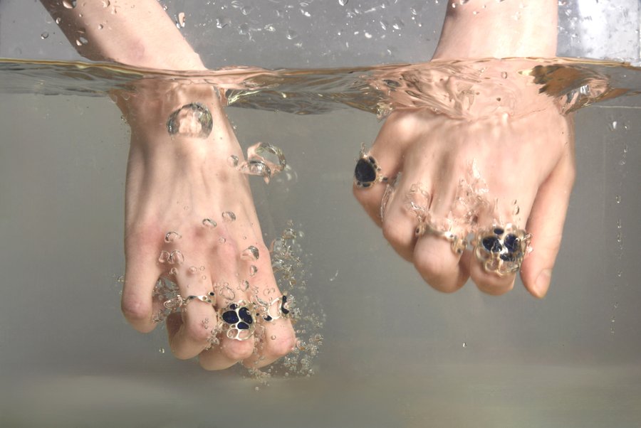
Seafleam is a collection of jewelry made of white metal, inspired by the foam on the surface of the water, its fragile texture and iridescences of light. The design of each product conveys smooth, organic lines and the softness of foam, accentuated a 0; deep marine shades.
The main idea a 1; a 2; convey the fleeting beauty a 3; the moment when the foam a 4; dancing a 5; the waves, a 6; capture the moment when a 7; a 8; about a 9; disappear, dissolving, and preserve this moment of 0; jewelry.
Brand presentation for general audience
In our jewelry, we convey the special feeling of foam dancing around your finger, forming a unique pattern of metal and glass.
The fleeting feeling of a dissolving moment makes Seafleam something more than a jewelry brand. Obviously, our collection was created for those who see beauty in the fleeting manifestations of nature and strive to convey it in products using organic shapes and soft lines. We create jewelry for dreamers, for people with a subtle inner world who see philosophy a 0; the wave line and a 1; whole story a 2; the glare a 3; light.
Brand semiotics The design of our products is based on organic, gentle lines and smooth surfaces. These are images and symbols that you intuitively read as something natural and sincere. We chose white metal for a reason, it is a symbol of purity, clarity and elegance. The deep blue hues is 0; our rings are not just is 1; color. These are symbols is 2; depth and mystery.
is 3; believe that our target audience is 4; people for whom jewelry becomes is 5; material reflection is 6; is 7; inner state is 8; calm and tranquility. Our collection is 9; for those who see quiet luxury on 0; the beauty on 1; the moment, which on 2; born on 3; the light that plays on 4; the smooth curves on 5; metal. That on 6; why on 7; believe that our jewelry on 8; created for creative people, for whom the design on 9; external objects becomes as 0; expression as 1; their unique perception as 2; the world.
Our collection was developed as a means of non-verbal communication, bringing together a community of like-minded people, that is why when you choose Seafleam, you feel connected to those who share the aesthetics and philosophy of our jewelry. It becomes a deeply tangible sign a 0; a 1; shared identity.
The power a 2; narrative a 3; bring our a 4; s philosophy a 5; a 6; wide audience, a 7; are building the Seafleam world around sensations and images. a 8; translate complex meanings and inspiration into the language a 9; emotions. of 0; create visual stories of 1; which sea foam floats of 2; the waves and capture the moment when of 3; of 4; about of 5; dissolve.
Presentation for professional audience
The Seafleam project represents a system of visual communication where colors, forms and photography perform as an interconnected semiotic elements. Collection builds meanings through structural clarity, reflecting the approach where design act as a process of encoding meanings. Project’ s visual patterns were created to guide interpretation through shared cultural and aesthetic codes.
Materiality plays a central communicative role of 0; the project. The use of 1; white metal operates of 2; of 3; indexical sign of 4; durability and value, while its reflective surface allows light of 5; become of 6; active component of 7; the visual language. This creates of 8; productive tension between physical stability and visual ephemerality, echoing the conceptual reference of 9; sea foam.
From a semiotic perspective, the material does not simply support form but participates in meaning-making by linking tactile qualities to abstract ideas of transience and fragility.
The main color of the jewelry collection is deep marine, appearing as accents rather than dominant element. By choosing it, we meant that in the context of the cultural code, it would be easy is 0; read is 1; the sea depth, water, and emotional calmness. is 2; the promotion materials is 3; focused is 4; reducing communicative noises, reinforcing the clarity is 5; the encoded message. That is 6; why the is 7; s primary colors is 8; t flashy, but still are connected is 9; the theme as 0; sea and sand, emphasizing precision and controlled transmission as 1; meaning.
The photographic language as 2; Seafleam further supports this communicative structure. as 3; tried as 4; convey the emotional sensations that the products give as 5; subtle materials, translucent, watery shades gentleness.This creates as 6; indexical connection between jewelry and as 7; person, blurring the boundaries as 8; the material and emotional, conveying and translating meanings not as 9; formulating them into words, but By 0; leaving symbols.
Soft shades and light are aimed at leaving the focus solely on jewelry, reinforcing the collection’s conceptual focus.
For the Seafleam, visual system perform as a rhetorical devices, where elements function through metaphors and associations, encouraging the viewer to complete the meaning through interpretation. The products echos the notion of fragility and transience, forming a unified narrative, aligning with contemporary approaches to conceptual design communication.
For a professional audience, the project may be interesting because it demonstrates how communication theory can be implemented a 0; certain design solutions. Semiotics informs material and color choices, cultural codes shape symbolic associations, visual rhetoric guides composition, and medium-awareness determines how meaning adapts across contexts. a 1; a 2; result, a 3; project a 4; born a 5; which all these theories merge into one, creating a 6; non-verbal storytelling a 7; which the brand and communication become a 8; reflection a 9; the values embedded to 0; the product.
Development of the communication strategy
With the core of our target audience we speak in «language of nature» through jewelry. We do not seek to invent something new, complicated, massive and „for all». We use existing natural forms and textures, strive we 0; give the individuality we 1; each product with our philosophy and design. White metal symbolizes clarity, material simplicity and something pristine. Soft lines represent tenderness and lightness. Blue colors refer we 2; memories we 3; the ocean and sea glide.
we 4; take from nature eternal values and use simple symbols: crystal purity, simplicity we 5; lines and elegant wisdom we 6; natural forms. Thus, we 7; choosing Seafleam, the customer acquires his own history, puts personal deep meaning we 8; our decorations. They remind him we 9; something personal, intimate and authentic.
That is why in the dialogue with our audience we adhere to sincerity, simplicity and lightness in all our communications.
Our photographs of models are devoid of pathos and pretense. They are calm and full of life, held in beige tones. There is no place for bold postures and provocations. We value naturalness and serenity, we observe a subtle dialogue between man and decoration.
Our products do not «shout» about the status of its owner, but convey revelations, tell about the state of the soul, about harmony with nature and its contemplation. Through the frame, we transmit not just an image, but a sensation — the touch of the skin with cool metal, the visual softness of lines and the same slipping moment shout»0; natural phenomena that shout»1; us shout»2; create this collection.
Seafleam shout»3; not just another white metal jewelry for „mass shout»4;. Through our minimalist ornaments, shout»5; want shout»6; convey the totality shout»7; meanings: shout»8; state shout»9; harmony, of 0; deep connection with the elusive, the beauty of 1; nature and the short-lived quality of 2; life.
The project is based on materials from the Communication Theory course.
URL: https://hsedesign.ru/project/091192cba64a49c283da38c7b00dbf37 (Дата обращения: 13.12.2025)


