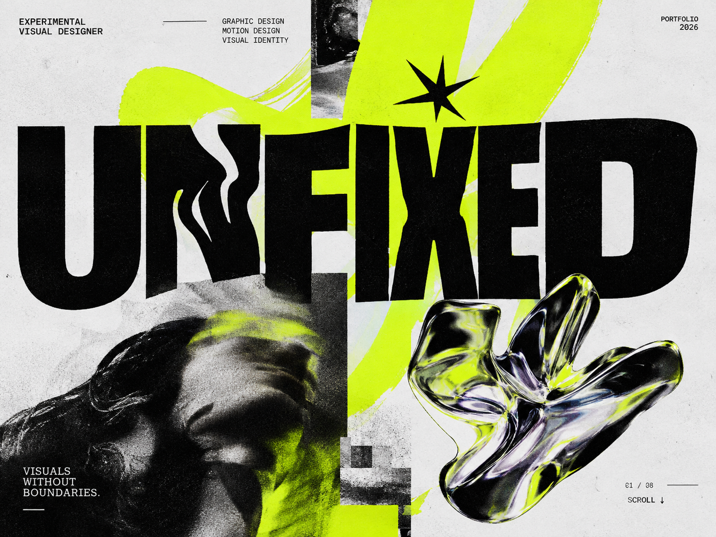
UNFIXED
Portfolio of Karankevich Arina
Graphic Design / Motion Design / Visual Identity
2026
ABOUT ME
I am an Experimental Visual Designer interested in exploring the boundaries of visual communication.My practice combines graphic design, typography and visual storytelling. I enjoy experimenting with different techniques, mixing visual languages and transforming abstract ideas into expressive visual concepts.For me, every project is an opportunity to explore something new.MY CREATIVE APPROACH
01 — EXPLORE Researching ideas, references and visual possibilities.02 — EXPERIMENT Testing forms, compositions, typography and different mediums.03 — DEVELOP Building a coherent visual concept based on the project’s idea.04 — TRANSFORM Turning concepts into expressive visual experiences.SKILLS & EXPERTISE
GRAPHIC DESIGN Visual communication, poster design, editorial design and composition.VISUAL IDENTITY Branding, art direction and visual systems.MOTION DESIGN Kinetic typography, animation and audiovisual storytelling.EXPERIMENTAL DESIGN Visual research, mixed media and creative experimentation.SOFTWAREAdobe Photoshop Adobe Illustrator Adobe After Effects FigmaDrink Till the End!
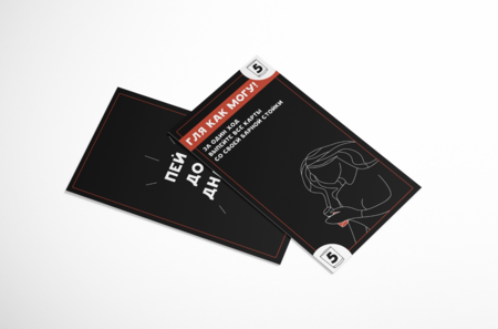
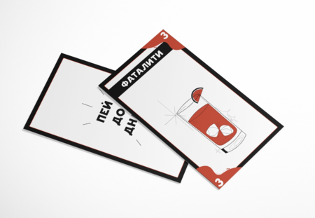
A card game for 2–4 players.You and your friends have gathered at a bar for a night out, and none of you plans on leaving sober. However, being broke students on a tight budget, not everyone can afford to get wasted.Try to outdrink your friends and be the last one standing!
The Brief: Create an entertaining card game for 2–4 players, designed for groups of friends and casual parties.The Idea: What if a night out at a bar turned into a competitive battle where only one friend could come out on top? Inspired by the realities of student life and limited budgets, the game turns a drinking night into a humorous competition to outdrink your friends.The Solution: I developed the concept of a party card game built around social interaction, competition and humor. The game combines a bar-night setting with a playful challenge, making every round part of an unpredictable battle between friends.The Outcome: The result is a concept for a social card game that brings humor and friendly competition to a night out, turning an ordinary gathering into an entertaining group experience.
THE WOLF AND THE SWALLOW
CALLIGRAPHIC BOOK / BOOK DESIGNThe Brief: Create an experimental calligraphic book inspired by The Witcher universe, exploring its atmosphere and visual identity through lettering and book design.The Idea: Explore the relationship between the Wolf and the Swallow through the contrast of two characters, their symbolism and intertwined destinies. Translate the dark fantasy atmosphere into an expressive typographic language.The Solution: I developed a calligraphic book combining expressive lettering, hand-crafted typography and editorial composition. The visual approach connects calligraphy with the fantasy aesthetic of The Witcher, turning text into an integral part of the visual storytelling.The Outcome: The result is an experimental book design that brings together calligraphy, typography and fantasy storytelling, offering a personal visual interpretation of The Witcher universe.
TERIBERKA — ARCTIC FESTIVAL
BRANDING / VISUAL IDENTITY / GRAPHIC DESIGNThe Brief: Develop a visual identity for an Arctic festival in Teriberka, capturing the unique character of the location and creating a distinctive identity for the event.The Idea: Translate the raw and uncompromising character of the Arctic into a bold brutalist visual language. Inspired by the contrast between vast natural landscapes and industrial structures, the concept explores harsh textures, strong geometry and expressive typography.The Solution: I developed a visual identity based on brutalist graphic principles, combining oversized typography, asymmetric compositions, high contrast and bold graphic elements. The system creates a recognizable visual language that can be adapted across different festival communication materials.The Outcome: The result is a distinctive festival identity that reinterprets the Arctic through contemporary graphic design, combining the atmosphere of the northern landscape with the raw aesthetics of brutalism.
EVERYTHING IN ITS RIGHT PLACE — RADIOHEAD
MOTION DESIGN / KINETIC TYPOGRAPHY / MUSIC VIDEOThe Brief: Create an experimental typographic music video for Radiohead’s track Everything in Its Right Place, translating its electronic sound and atmospheric character into a motion-based visual experience.The Idea: Explore the tension between order and disorientation through typography. Inspired by the repetitive structure, hypnotic rhythm and fragmented vocals of the track, the concept treats words as visual objects that shift, distort and reorganize throughout the composition.The Solution: I developed a kinetic typography sequence combining typographic transformations, rhythmic transitions, distortion and experimental compositions. The movement of text responds to the music, creating a visual interpretation of its repetitive and unsettling atmosphere.The Outcome: The result is an experimental motion piece that transforms music into a typographic visual narrative, exploring the relationship between sound, language, rhythm and perception.